Monday, February 28

elisa zeppilli

elisa zeppilli is the talent behind fluttuo, a refreshingly-original collection of jewelry that makes me giddy. elisa hand-picks the materials during her frequent travels through europe and the united states. my favorite fluttuo pieces from the 2011 collection include meryl & isabelle. from the 2010 birthday collection, i love this little daisy bracelet. go discover your favorites, and be sure to find fluttuo on facebook for photos and updates on new collections!


i took these colors from the original fluttuo logo because they represent the beginning of my passion. i started fluttuo because i needed to do something that i really felt was mine—i needed to free myself, my creativity and make something beautiful and really unique with my own hands.

the name fluttuo (i float, in italian) was born from the idea that wearing a fluttuo creation would make you feel happy and light almost like floating in the air. all the fluttuo pieces are unrepeatable. this means that every woman who chooses a fluttuo design will be the only one to own and wear it. i think it's important for each of us to find ourselves the way we really are, without following trends, but choosing our own style and soul.

Friday, December 31

barnaby ward

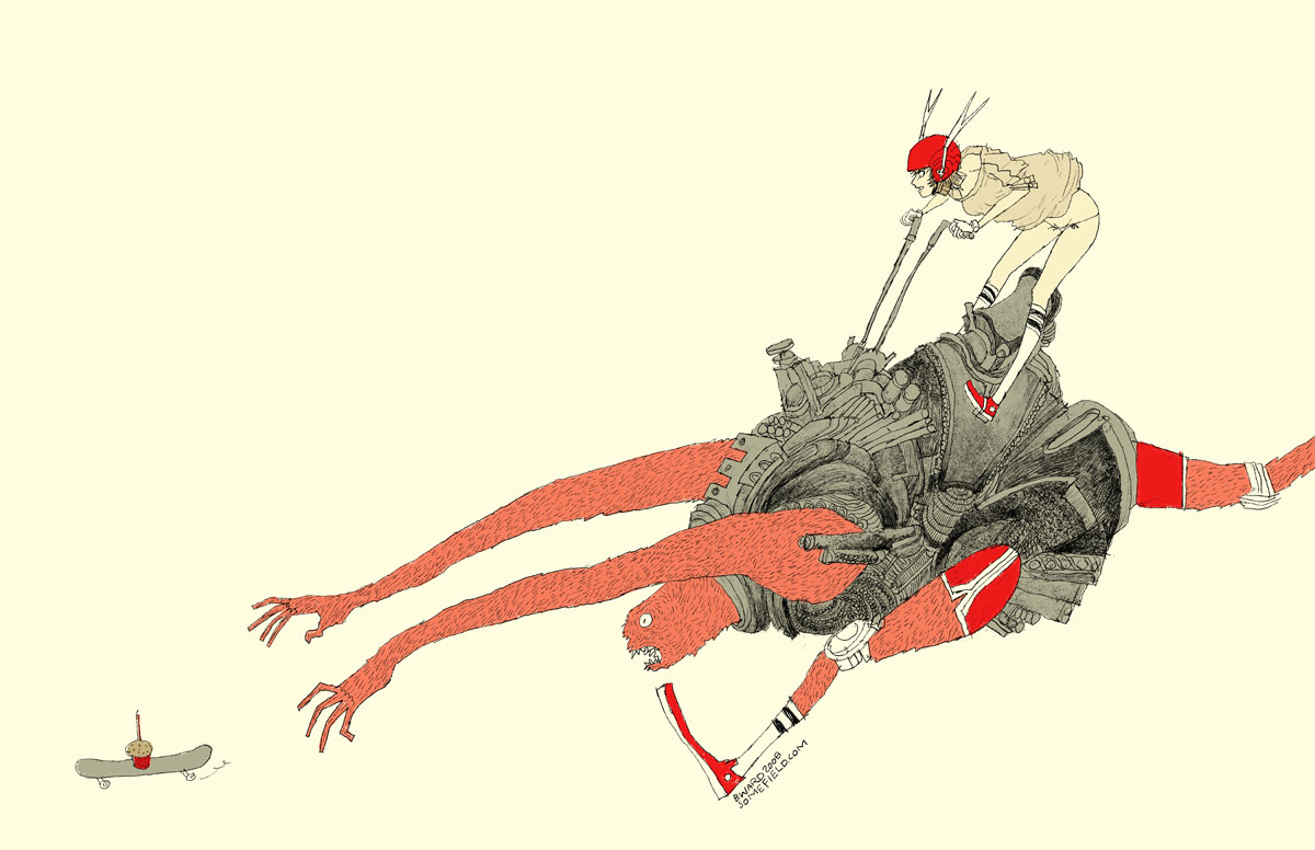
wave goodbye to 2010 with barnaby ward from barbados! he is the talented illustrator behind somefield, a magical place filled with liney ladies cradling insects. i am in love with his minimal backgrounds and exciting flashes of color. there are far too many wonderful pieces to list all of my favorites, but here are the top three: 1 | 2 | 3. you can purchase prints here or here, and for a little desktop joy, click here.


1—midnight misregistration
2—the sad eggplant
3—someone put lipstick on the cat’s butt again
4—suffocating silt cloud
5—bronchitis is gross

Tuesday, December 28

diego gravinese

soft frost comes to mind when i view the work of diego gravinese. the argentinian painter captures intimate moments in a wonderfully cold way. i find the layered compositions and cool palette calming, yet engaging. the paintings i enjoy most are milk girl, las leyes naturales, and my favorite thoughts (when i feel like a woman). also, be sure to check out gravinese’s older work so you can experience the interesting progression of his art.


1—the main color in milk girl. i love it because it is reminiscent of childhood memories—those light teal tiles of 70s kitchens.

2—the color of faded skies according to kodak slides.

3—skin. the central tone of the solar system in my paintings.

4—some sort of undefined grey. shadows are made of a mix of all the surrounding colors, and i love greys and non-colors for that same reason.

5—red. my favorite color.

Tuesday, October 19

dana oldfather

dana oldfather’s progressive colors and organic forms inspire feelings of quiet euphoria. unknown creatures reminiscent of space and sea float about in a delightful mess of oils, alkyd & marker. among my favorites are feeding, candy coated couch, waking, and this lovely minaret print from little paper planes. you can view her studio (always fun for me), paintings in progress, and show updates on her blog.

dana chose these colors from crowning fire, a new painting, which will be on display november 19th through december 31st at the bonfoey gallery in cleveland, ohio.


in art i have always tried to connect to the world through beauty. each work is an attempt to elegantly express the embodiment of paradox; a physical manifestation of conflicting desires communicated in an abstract arrangement of forms.

Sunday, October 17

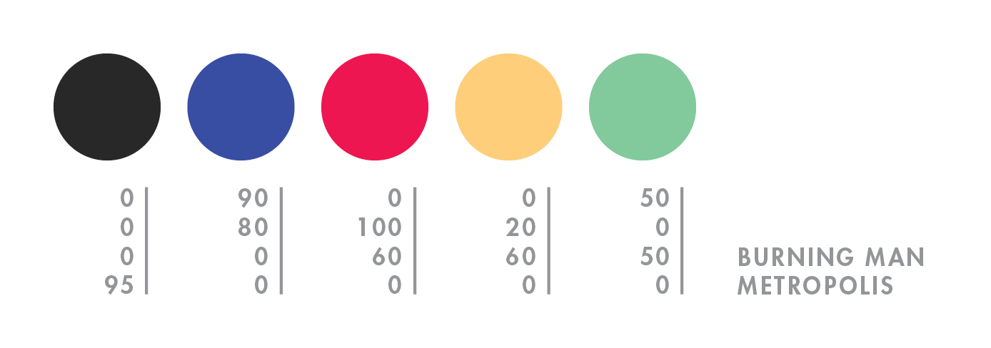
burning man

hello mid-october. it feels like i just returned from burning man, but NO—it was over a month ago! what a slacker i am. to explain burning man to someone who has never been is painful and damn near impossible (for me, at least). so here’s a quick visual re-cap of this year’s burn:


day 1—waited in the longest (and most exhilarating) line of my life.

day 2—move in + rain! + rare supernumerary double rainbow.

day 3—campmate sleeps + first view of the temple + silly self portrait + campmate porta anxiety + party time + bliss dance + deutsch hilarity + happy glow.

day 4—biking with campmate + frolicking in my bloomers (thanks mom) + up all night + dodge a dragon + bubble sunrise + sigh

day 5—alien sighting at center camp + sensory overload + meet martin + temple snuggling + middle of nowhere + surprise! 4am grilled cheese under the stars + stumbling home in the dark.

day 6—raining skydivers + one last ride out to the man + waved goodbye to the lamplighters.

for a wonderful literary description of burning man, here’s the best i’ve read by robin esrock.

Friday, September 10

christopher michel

who needs color with christopher michel around?! okay, that’s crazy talk coming from me, but you’ll understand as soon as you click here, here, and also here. the clarity, contrast, and composition—SO spectacular! now back to my senses. here’s some hot color action like you’re used to, both lady & man. christopher is more than just a talented photographer—you can read about his other endeavors here.


the 4 blue shades were chosen to represent the linear progression of people throughout their lives while the offset green box represents those who have chosen an altogether different path. i’m reminded of apple’s famous ad.

Thursday, September 9

randy polumbo

while i organize my thoughts from this year’s burn, here’s a fond memory from 2008:

i was biking through the playa at midnight when i came across a colorful garden of glowing sex toys*. it was a solar-powered art installation by randy polumbo, a pioneer for off-the-grid living. polumbo’s art was the talk of many that year, as it bobbled slightly in the cool desert breeze. you can view additional work by visiting randy’s website. AND for my favorite part—go here > videos > the grotto and garden of manifest destiny to see randy talk about his art and his experience at burning man.


*photo compliments of stargazer95050.

Monday, August 2

scott london

scott london is a talented journalist, author, and photographer who has been capturing the magic that is burning man since 2004. black rock city is such a vast, intricate, and indescribably beautiful experience—i am always elated when i stumble upon photographers who have managed to record that beauty forever. here are a few of my favorite moments—blue couple, white stilts, playa nap, and lady in pink. you can read more about scott and his many fascinating adventures here.


1—burning man is set against a backdrop of desert, mountains and sky. its defining feature is the playa—a vast empty canvas for creative self-expression. i love it when the wind kicks up and the entire place is hurled through with dust.

2—watching the sun rise over the black rock mountains is one of life’s most exquisite rewards. the first rays of light are a golden yellow and always inspire a kind of hushed reverie.

3—the skies are never as blue as they are in the black rock desert. in the morning, shortly after sunrise, or in the late afternoon before dusk, i like to drag people out on the playa and make portraits against the soft blue sky.

4—as most burners will tell you, the event only fully comes alive at night when the playa is transformed into a carnival of flashing neon signs, wacky art cars, pyrotechnic displays and pulsing soundscapes. even on a moonless night, the sky is dark blue, alight with stars.

5—the beauty of fire is that it contains within it a remarkable spectrum of colors, from purples and reds to oranges and yellows. when the man goes up in flames toward the end of the event, the heat from the fire is so intense you can feel it a half-mile away and so bright you need sunglasses. a dazzling spectacle.

Tuesday, July 27

elodie rambaud

everything elodie rambaud touches turns to pretty. in addition to her eye for color and detail, this french stylist has such a charming sense of composition, and much of her work features FOOD—even better! you may want to grab a snack—favorite elodie stylings include pea chervil, blueberries, and meringue. if you’re a fan of interiors, don’t miss her interior styling portfolio.


p.s. who knew that particular yellow would look SO good next to that pink?

Sunday, July 11

cynthia ona innis

what i find most compelling about the work of cynthia ona innis is the way she captures the flourishing minutia of life. i have been admiring her work for some time, but last month i was able to view it in person at the sf fine art fair— the online photos simply do not do her justice. my favorite pieces include tug, fugitive, and power plant. if you’ll be in los angeles this november, be sure to attend her show at the walter maciel gallery!


i worked with summertime childhood memories to come up with these colors. growing up near the beach & bay in san diego, the colors of the water kept coming to mind. then there are a few other colors: my mom’s (paint-peeling) car in the 70s/80s and this bubblegum ice cream they made by hand at ocean beach.

Sunday, June 27

san francisco pride

i scored a sweet spot on market street at third. it was oddly warm and completely fog-free. i fiddled with my camera in an attempt to distract myself from the annoyingly oblivious, yet cute italian tourists that kept stepping on my blanket and kneeing me in the back. initially things were very exciting—dykes on bikes, fancy ladies, and a vegan pig, but the sf pride parade is incredibly LONG, and i only lasted one hour before i had to make a pit stop at the palace. naturally i lost my spot so i herded underground to hop on muni toward the civic center; however, i was not prepared for that amount of choas DURING the parade, so i reversed course and started walking, or rather skillfully darting to protect my camera from the sloshing fountains of beer. i made it to the civic center in about 30 minutes, at which point i decided i couldn’t possibly carry around my bag ALL afternoon. i walked home, relaxed for a bit, and then walked back. i have no idea what time that was, but the parade was still blasting! this time i was unable to cope with the madness so i started drinking (thank you for the free shots!), which was an excellent decision as i ended up with some garlic fries, annihilating a chicken kabob (completely uncharacteristic of me), and doing a trance dance (also atypical) with a group of local femmes. i staggered home for the second time and collapsed on my futon, which is when i discovered that i'd only taken 25 mediocre photos—FAIL! aw, well…40 & fabulous! i hope i’m that much fun when i turn 40.

Wednesday, June 16

jean-luc picard

i will be the judge of what is reasonable! in celebration of captain picard day, i bring you mon capitán in cmyk. every night my husband and i meet on the couch…er, futon for an episode or two of star trek > tng before bed. it’s one of the few activities we both enjoy, and i’m sure we’ll still be watching when we’re 80.


favorite picard quotes:
1—the line must be drawn here—this far and no further!
2—villains who twirl their mustaches are easy to spot. those who clothe themselves in good deeds are well camouflaged, waiting for the right climate in which to flourish, spreading fear in the name of righteousness.
3—tea, earl grey, hot.

Tuesday, June 1

peter clark

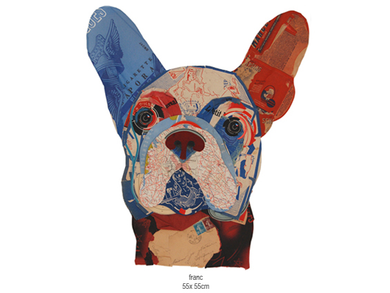
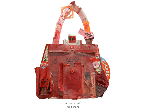
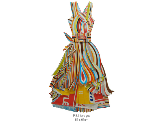
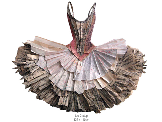
today i bring you peter clark! i was able to view his stunning collage work in person last weekend at the san francisco fine art fair, where he was represented by rebecca hossack art gallery. peter uses his collection of old stamps, faded maps, love letters, buttons, and various other objects to assemble his collages. his mastery of color and shape allow these seemingly random items to form a cohesive and awe-inspiring entity. my favorites include franc, ten and a half, p.s. i love you, and too-2-step.


these happen to be my colours of the day, 1st june 2010. pleasing and inspiring.
converted from mypantone solid coated: 290 | 584 | 437 | 1788 | 163

Sunday, April 18

jez burrows

jez burrows, designer and illustrator, uses colors that make my heart sing, and when you pair that with infographics i get a little giddy. my favorites include instal 09, celestial feats, and the modern listener’s guide—screenprint available in his shop! you can also find burrows over at sing statistics, the independent publishing concern he runs with illustrator, lizzy stewart.


here are five colours that make up my print for kitsune noir’s poster club earlier this year, based on thoreau’s walden. they’re currently quite fresh in my mind as i’ve just had a screen printed version of the print made, that should be available soon*. i really need to quit using the second green in things.

*update: they are available now!

Sunday, April 11

danny thompson

danny thompson is a talented designer, currently based in dallas. his work is striking, clean, and warm—all of the things i love to see in design. his kimberly harper website and usps annual report are two wonderful examples of this, but it was this illustration of bob dylan that first caught my eye on behance. i am also a fan of his camera work. to see more of danny’s creations, go check out his new website!


i draw lots of inspiration from the natural weathering of things from the past. with varying shades of brown, this palette has always worked well for me. the red/maroon works great as an eye catcher amid the neutral colors.

Friday, March 19

rilla alexander

guten nacht! tonight i bring you rilla alexander, an australian illustrator who lives and works in berlin. she is incredibly talented and quite hilarious, which i discovered while reading about anthropomorphized pets on her blog. her illustrations are equally entertaining—i especially enjoy the unique shapes and organic linework. my favorite rilla projects include sozi as little red cap, a voyage to the valley, and sleep seasons room—what a fantastic place!


i chose the colours of the 2010 studio on fire calendar which i contributed to (alongside other illustrators like brian gunderson, cecilie ellefsen and little friends of printmaking). every year studio on fire letterpress these luscious calendars in wonderful colour combinations that are unlike the palettes i usually pick. because, to be honest, i would be happy to only ever work in one colour—red (or c:0 m:100 y:100 k:10 to be precise).

Wednesday, March 17

st. patrick’s day

i awoke to the charming sound of bagpipes this morning. i live in downtown sf, so i get to hear all sorts of shenanigans echoing off the cement that surrounds me. i have SO much to do today, but i plan to make time for a green beer before the day ends.


these colors were inspired by the irish flag, and this bunch of balloons, which i photographed on saturday at the saint patrick’s day parade.

Tuesday, March 16

thea schrack

thea schrack is a san francisco photographer and encaustic painter. i wasn’t familiar with encaustic painting prior to viewing her work—the process involves adding colored pigments to hot beezwax, which is then applied to the surface. what i love most about thea’s work is the distinct atmospheric presence—each piece leaves me with a nostalgic, dream-like feeling. some of my favorites include small bird, redwing blackbird 2, magnolia 1, red branches 1, and blue weeds. you can find recent work and inspiration on thea’s blog.


that was really fun, and a surprising color combination for me. i picked colors from forest tapestry, a piece that is on my blog.

Wednesday, March 10

blogiversary

AHH…i just realized that today is my one-year blogiversary—how exciting! exactly one year ago today i started collecting cmyk colors. i am thrilled at how many wonderfully-creative people decided to participate! i love watching for parallels between the colors and a person’s life, and in some cases, the shock of finding the complete opposite. i think one’s color palette is not unlike their shoes—it says so much about them.


here is a look at my colors from a year ago…not much has changed.

Monday, February 15

katie kirk

illustrator, katie kirk is a master of the bézier curve. she successfully simplifies complex ideas and turns them into light-hearted vector fun. my favorites include queen pattern, head, and birds. also, be sure to check out her soon-to-be-published book, eli, no!


i chose the colors from this. not really sure why—they just seemed fun ;)