Showing posts with label brown. Show all posts

Monday, August 2

scott london

scott london is a talented journalist, author, and photographer who has been capturing the magic that is burning man since 2004. black rock city is such a vast, intricate, and indescribably beautiful experience—i am always elated when i stumble upon photographers who have managed to record that beauty forever. here are a few of my favorite moments—blue couple, white stilts, playa nap, and lady in pink. you can read more about scott and his many fascinating adventures here.


1—burning man is set against a backdrop of desert, mountains and sky. its defining feature is the playa—a vast empty canvas for creative self-expression. i love it when the wind kicks up and the entire place is hurled through with dust.

2—watching the sun rise over the black rock mountains is one of life’s most exquisite rewards. the first rays of light are a golden yellow and always inspire a kind of hushed reverie.

3—the skies are never as blue as they are in the black rock desert. in the morning, shortly after sunrise, or in the late afternoon before dusk, i like to drag people out on the playa and make portraits against the soft blue sky.

4—as most burners will tell you, the event only fully comes alive at night when the playa is transformed into a carnival of flashing neon signs, wacky art cars, pyrotechnic displays and pulsing soundscapes. even on a moonless night, the sky is dark blue, alight with stars.

5—the beauty of fire is that it contains within it a remarkable spectrum of colors, from purples and reds to oranges and yellows. when the man goes up in flames toward the end of the event, the heat from the fire is so intense you can feel it a half-mile away and so bright you need sunglasses. a dazzling spectacle.

Tuesday, July 27

elodie rambaud

everything elodie rambaud touches turns to pretty. in addition to her eye for color and detail, this french stylist has such a charming sense of composition, and much of her work features FOOD—even better! you may want to grab a snack—favorite elodie stylings include pea chervil, blueberries, and meringue. if you’re a fan of interiors, don’t miss her interior styling portfolio.


p.s. who knew that particular yellow would look SO good next to that pink?

Tuesday, June 1

peter clark

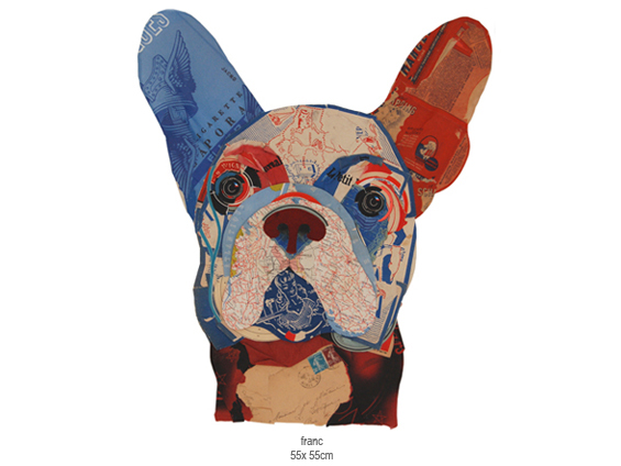
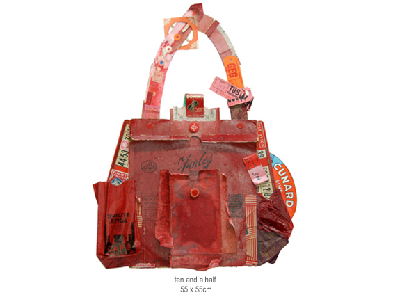
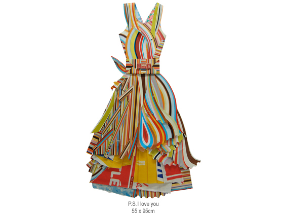
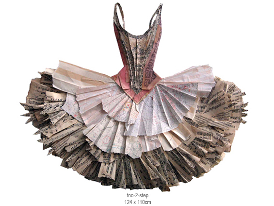
today i bring you peter clark! i was able to view his stunning collage work in person last weekend at the san francisco fine art fair, where he was represented by rebecca hossack art gallery. peter uses his collection of old stamps, faded maps, love letters, buttons, and various other objects to assemble his collages. his mastery of color and shape allow these seemingly random items to form a cohesive and awe-inspiring entity. my favorites include franc, ten and a half, p.s. i love you, and too-2-step.


these happen to be my colours of the day, 1st june 2010. pleasing and inspiring.
converted from mypantone solid coated: 290 | 584 | 437 | 1788 | 163

Sunday, April 11

danny thompson

danny thompson is a talented designer, currently based in dallas. his work is striking, clean, and warm—all of the things i love to see in design. his kimberly harper website and usps annual report are two wonderful examples of this, but it was this illustration of bob dylan that first caught my eye on behance. i am also a fan of his camera work. to see more of danny’s creations, go check out his new website!


i draw lots of inspiration from the natural weathering of things from the past. with varying shades of brown, this palette has always worked well for me. the red/maroon works great as an eye catcher amid the neutral colors.

Friday, March 19

rilla alexander

guten nacht! tonight i bring you rilla alexander, an australian illustrator who lives and works in berlin. she is incredibly talented and quite hilarious, which i discovered while reading about anthropomorphized pets on her blog. her illustrations are equally entertaining—i especially enjoy the unique shapes and organic linework. my favorite rilla projects include sozi as little red cap, a voyage to the valley, and sleep seasons room—what a fantastic place!


i chose the colours of the 2010 studio on fire calendar which i contributed to (alongside other illustrators like brian gunderson, cecilie ellefsen and little friends of printmaking). every year studio on fire letterpress these luscious calendars in wonderful colour combinations that are unlike the palettes i usually pick. because, to be honest, i would be happy to only ever work in one colour—red (or c:0 m:100 y:100 k:10 to be precise).

Sunday, February 14

heart day

i like valentine’s day. growing up, my mom always bought me thoughtful little pink and red gifts. also—chocolate and stunning paper products! okay, so those are all consumer-based, but i think i’m okay with that. if i could only shop on one day, it would be valentine’s day. plus, the alternative is being one of those cynical anti-valentine* types, and i’m far too happy to venture down that road just yet. i hope you had a happy heart day, and if not you still have time to buy yourself a candy bar and cry yourself to sleep on the sofa.


green & black’s toffee milk chocolate | roses downtown | my pink t-shirt

*sorry anti-valentiners. i enjoy your rants on the bad days.

Tuesday, February 2

allison cole

allison cole is a fantabulous illustrator working her surface-design magic in providence, rhode island. her illustrations are very charming, and the best part is when she gives vegetables a voice. my favorites include veggie poster, what i wore today, feathers, robots, and take us home, which can be purchased on a tote—hooray! for updates, be sure to stop by allison’s blog, and if you’re a comic fan, take a look at her never ending summer.


recently i’m loving nature-inspired colors and really looking forward to spring. i love using shades of the same color and creating texture within the different values.

Sunday, November 22

alvin diec

i stumbled upon the work of alvin diec way back in august, but i was too busy preparing for my first international trip to write him a proper post. diec is an atlanta-based designer who does what i can only think to describe as beautifully-clean work. his love of food has inspired some wonderful projects, including one flew south and the buccaneer, two of my favorite stationery sets. other notables include his fleet foxes poster and pygmalion theatre promotion, which i yearn to see in detail. finally, if you are in need of design clarity or just want to see what diec is thinking, check out his blog!


the idea is pretty simple. food and drink are probably two of my favorite things. ever. so it happens, i spent a few years doing design primarily for the restaurant industry. it comprises a large part of my portfolio and still represents much of the work i’m most proud of. we’ll just go through a small meal of things i really enjoy, in no particular order: crispy bacon, cloudy wheat beer, plain ol’ white rice, fresh greens, and hot coffee. cheers.

Thursday, October 1

nara

we contemplated skipping the day trip to nara all together. we grew up around deer so it didn’t seem worth the bumpy train ride through the mountains—my husband gets pretty severe kinetosis. we were thrilled to be wrong. it may have been the most enjoyable thing we did together. in retrospect it makes sense, we both get more excited about animals than people. and when they look like this, how could you not love them? the secret to enjoying the deer in nara is this—either buy shika sembei (deer biscuits) and quickly feed the deer or do not purchase biscuits at all. running around trying to photograph the deer while taunting them with biscuits proved traumatic for many visitors that day. the deer have learned that head-butting the men in the groin make the biscuits magically fall from the sky. since women often squeal and run, the deer chase them in a herd until the biscuits are surrendered. they do seem to leave the children alone for the most part, only reaching high into the air to snatch the biscuits from the smallest ones. and the cutest thing happens while they await their treat—they bow! some say they have learned to imitate the japanese, others (my husband) says they are simply preparing to buck you in the crotch. either way, it is done with the tongue slightly out and is the cutest thing i’ve ever seen.


bambi bow.

Tuesday, September 29

gion

exploring gion’s rain-soaked alleys was a magical experience. the machiya architecture with its lovely lanterns, bamboo inu yarai, and ceramic roof tiles all add to to the mysterious beauty of this well-known geisha district. i was lucky enough to catch a glimpse of both geiko and meiko—two in the back of a black car, and i passed another in a narrow alley. i do not have photos of these encounters as i decided to constrain my gaijin instincts and respect their privacy, but i was excited to find that they are even more stunning and graceful in person. hopefully these traditional artists continue to perform in the future. i have a lot of respect for women who brave the rain in a kimono.


mysterious geiko.

Saturday, September 26

himeji castle

we took a day trip to himeji to see himeji castle, also known as the white heron. its the most impressive castle ive seen, complete with moat, stoney fortress, super steep stairs, and secret doors. and if that werent enough to remember, my first cup of matcha was served at the koko-en garden tea house. it was hot, frothy, and my favorite hue of green. i even learned how to make it using a bamboo chasen! and although my sugar handicap prevented me from sampling the wagashi, i was able to capture the handmade confection forever. banzai!


matcha castle.

Wednesday, September 23

arashiyama

arishiyama is an area in northwest kyoto. we went for two things—the sagano bamboo forest and tenryu-ji temple. walking through the bamboo was quiet and surreal. the forest was cool and wet—we were completely drenched by the time we reached the temple. tenryu-ji offered a rest on tatami mats, beautiful color-changing flowers, meticulously-maintained gardens and additional views of the bamboo.


bamboozled.

Friday, September 18

pontocho

pontocho is a narrow alley known for its geisha houses. i didn’t see any geisha, but i did see lots of restaurants and tourists. i found the area visually charming because of the multitude of lanterns and illuminated signs, window decor, and welcoming spaces. the people were also very friendly, despite the many tourists arguing loudly about where to eat. i was glad to have eaten udon at my favorite noodle place before we arrived.


pretty pontocho.

Thursday, September 17

nijo castle

nijo castle is surrounded by the most gorgeous greens ive ever seen. the foliage, the moat, the aging metals, are all lovely shades of midori (green). the best part for izaak was the ninomaru palace—an audio technicians dream with its singing nightingale floors.


natures song.

Wednesday, September 16

kamakura

we took a day trip to kamakura to see yabusame, or japanese archery. there is a festival at the hachiman-gu shrine twice a year. it is apparently very popular because all we ended up seeing where the shinto people praying and the grounds as we ran through the forest looking for a better view. i finally lucked out and was roped off by a police officer where i got close enough to capture the archers making their way to their horses—the costumes were elaborate and worth the wait.


yabusame wardrobe.

Friday, September 11

asakusa

my favorite part of tokyo so far is probably asakusa, pronounced uh-sock-sa. why? because i was in kokeshi heaven. everywhere i went, kawaii kokeshi! and there were other things such as wagashi, umbrellas, and washi. if youre not into shopping, you can relax at the sensō-ji temple, with this man, or go check out the five-story pagoda next door.


is there a kokeshi temple?

Sunday, September 6

yanaka

after all of those deafening games and flashing lights, we were ready to see the quieter side of tokyo, so we made our way to the neighborhood of yanaka, located near ueno in the taito ward. first, we stared pensively at the tenno-ji temple. it was sublime until we spotted the giant black ants marching toward us and decided to move it along, through the picturesque yanaka cemetery. then we got lost in a lovely neighborhood and ended up at the choan-ji temple, where we saw an apple tree, mating butterflies, and were bitten by what appeared to be little black and white mosquitoes—they especially loved izaak. it was just enough nature to remind us that we prefer chaos to quiet.


where tanukis frolic.

Saturday, August 15

paola zakimi

paola zakimi is an exquisite doll maker living in argentina. she carefully sculpts, sands, paints, and clothes each one. when finished, she captures the doll in a charming portrait. here are a few of my favorite little characters—abigael, girolamo, matryoska, and this unamed girl. you can adopt a doll by visiting paolas etsy shop.


these colors are from my last painting and le petite cocoon. i am currently working on a new piece with similar light colors.

Friday, August 14

erik hamline

minneapolis-based designer, erik hamline, has created some memorable identity pieces among other things. i am particularly excited about his seaward and belmont associates projects. and, as a fan of neon, i must bring your attention to this curious letterpress ephemera created for aiga minnesotas design camp—i would love to see this one in person. erik currently runs hot snot print shop with fellow creative, david dresbach.


of the things i need/want to consume and buy and surround myself with i am only drawn to raw materials—iron, wood, stone, leather, glass, etc. character, i feel, is the most desirable and aesthetically pleasing trait an object or a person or a place can carry. age, weather, use. im really drawn to history and looking at things and places, and seeing all of the hands that have used that tool and all of the feet that have mulled over the bricks—it really hits a sweet spot for me. these places and things have been around a whole hell of a lot longer than i have and will continue to be perfectly functional well after im dead.

these particular ones are snatched from a snapshot of some high plains in new mexico. there is so much color and vivid contrasts in the places that tend to be portrayed as the most plain.

Saturday, August 8

alexis marcou

talented british artist, alexis marcou, spends his days in gorgeous greece. what i love about marcous work is that his lines are simultaneously fluid and soft, yet raw and fierce. my favorite projects are those in which he combines type with his beautifully-rendered drawings, as in fuel and panda. you can find prints by marcou here.


my colors are very minimal and i usually prefer to have a slight contrast between them in order to emphasize the pencil work.