Showing posts with label illustration. Show all posts

Friday, December 31

barnaby ward

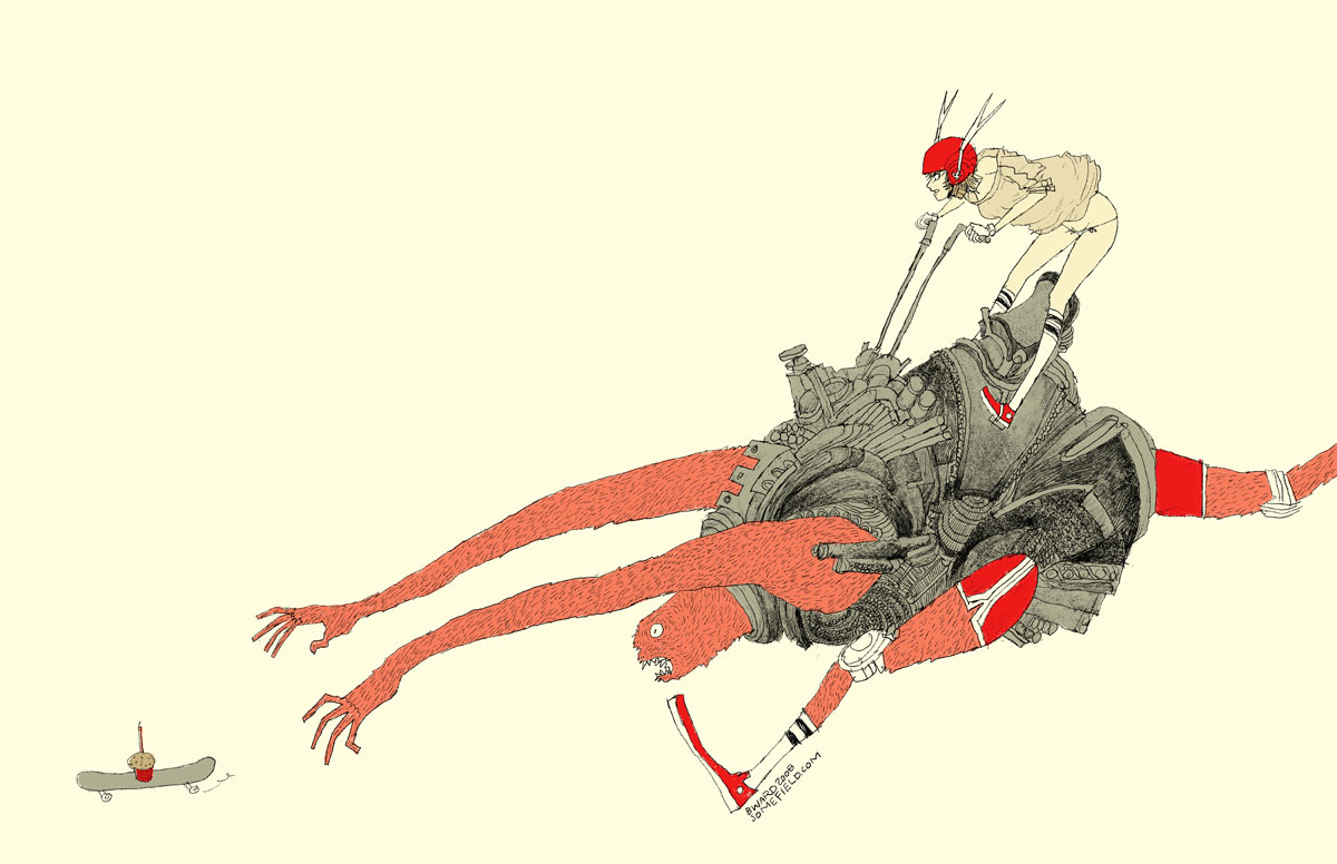
wave goodbye to 2010 with barnaby ward from barbados! he is the talented illustrator behind somefield, a magical place filled with liney ladies cradling insects. i am in love with his minimal backgrounds and exciting flashes of color. there are far too many wonderful pieces to list all of my favorites, but here are the top three: 1 | 2 | 3. you can purchase prints here or here, and for a little desktop joy, click here.


1—midnight misregistration
2—the sad eggplant
3—someone put lipstick on the cat’s butt again
4—suffocating silt cloud
5—bronchitis is gross

Sunday, April 18

jez burrows

jez burrows, designer and illustrator, uses colors that make my heart sing, and when you pair that with infographics i get a little giddy. my favorites include instal 09, celestial feats, and the modern listener’s guide—screenprint available in his shop! you can also find burrows over at sing statistics, the independent publishing concern he runs with illustrator, lizzy stewart.


here are five colours that make up my print for kitsune noir’s poster club earlier this year, based on thoreau’s walden. they’re currently quite fresh in my mind as i’ve just had a screen printed version of the print made, that should be available soon*. i really need to quit using the second green in things.

*update: they are available now!

Sunday, April 11

danny thompson

danny thompson is a talented designer, currently based in dallas. his work is striking, clean, and warm—all of the things i love to see in design. his kimberly harper website and usps annual report are two wonderful examples of this, but it was this illustration of bob dylan that first caught my eye on behance. i am also a fan of his camera work. to see more of danny’s creations, go check out his new website!


i draw lots of inspiration from the natural weathering of things from the past. with varying shades of brown, this palette has always worked well for me. the red/maroon works great as an eye catcher amid the neutral colors.

Friday, March 19

rilla alexander

guten nacht! tonight i bring you rilla alexander, an australian illustrator who lives and works in berlin. she is incredibly talented and quite hilarious, which i discovered while reading about anthropomorphized pets on her blog. her illustrations are equally entertaining—i especially enjoy the unique shapes and organic linework. my favorite rilla projects include sozi as little red cap, a voyage to the valley, and sleep seasons room—what a fantastic place!


i chose the colours of the 2010 studio on fire calendar which i contributed to (alongside other illustrators like brian gunderson, cecilie ellefsen and little friends of printmaking). every year studio on fire letterpress these luscious calendars in wonderful colour combinations that are unlike the palettes i usually pick. because, to be honest, i would be happy to only ever work in one colour—red (or c:0 m:100 y:100 k:10 to be precise).

Monday, February 15

katie kirk

illustrator, katie kirk is a master of the bézier curve. she successfully simplifies complex ideas and turns them into light-hearted vector fun. my favorites include queen pattern, head, and birds. also, be sure to check out her soon-to-be-published book, eli, no!


i chose the colors from this. not really sure why—they just seemed fun ;)

Tuesday, February 2

allison cole

allison cole is a fantabulous illustrator working her surface-design magic in providence, rhode island. her illustrations are very charming, and the best part is when she gives vegetables a voice. my favorites include veggie poster, what i wore today, feathers, robots, and take us home, which can be purchased on a tote—hooray! for updates, be sure to stop by allison’s blog, and if you’re a comic fan, take a look at her never ending summer.


recently i’m loving nature-inspired colors and really looking forward to spring. i love using shades of the same color and creating texture within the different values.

Monday, January 25

elsa mora

wow, where do i begin? elsa mora, aka elsita, is a cuban-born artist whose talent exceeds classification. i knew of her first as a paper artist, responsible for perfectly-curved edges and the conceptually-brilliant paper sculpture, fears, and el corazon. more recently, i’ve been following her—GASP personal style, which has left me equally enchanted and a tad underdressed. her creations span all media—here, a few of my favorite gems: el jardin de maria julia, missing garden, mimi, unlimited flower protection, felted necklace, emanuel, her way, uchi…i really could go on forever. OH, and did i mention her new book?! for updates on all things elsita or to purchase her lovely creations, stop by her main blog.


here i did a selection of colors that i love. but the truth is that i love all the colors in the rainbow. to me each color is a door to a new world, each one of them has a personality, a language and i’m always curious to see what they “have to say”.

Wednesday, January 13

lindsey manwell

lindsey manwell is a san francisco children’s book illustrator who creates some of the most enchanting scenes. her soft little characters appear to lead such charmed lives. my favorite illustrations include windup, tort, shelf, and one of her new characters, wart. you can follow her blog for recent work and activities.


i don’t really know why anyone is drawn to the colors that they are drawn to, but i do know that the most emotion for me, from any picture, comes from the color compilation. i’ll never forget seeing sargent’s fumée d’ambre gris—it was perhaps this image that made me become an artist all together, it was that powerful. i tend towards lighter, muted colors all over with highlights of deep, rich color.

Tuesday, January 12

christine berrie

i am thrilled to bring you glasgow-based illustrator, christine berrie. i am fascinated by her drawing collections. hooray for microcars, alarms, and my absolute favorite—cameras! if cameras aren’t your thing, check out her etsy shop, which is filled with all sorts of carefully-rendered treasures.


christine’s influences* london markets, bric-a-brac, flickr, vintage picture books, old buildings, glasgow city centre, antique shops, vintage posters, printed ephemera and found scraps, tickets, retro film posters, london underground and the tate modern.

*via comarts.

Sunday, December 6

cate anevski

cate anevski is a creative extraordinaire that i found on flickr…back in march! for some reason we keep losing each other in the interwebs. i email her, she emails me, i never get it, i email again, she emails me, i bury the email in my box—no more of this—it is time! what i love most about cate’s work is her charming outlook on the world. her unique style is present in every medium she uses. my favorite illustration work includes celtic knot, marie antoinette, and elemental nymphs, which are now available in cate’s etsy shop! i’m also a fan of her eleven-eyed monster and leet embroidery skills. for recent work, updates, and all things worth doing in portland, stop by her blog.


i have recently undergone my first portland, oregon, winter, and the gray weather left me a bit starved for the warm colors of the sun. my latest illustrations reflect this with a bright pink and orange palette.

Monday, October 19

michelle ‘milo’ white

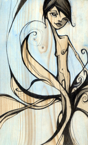
michelle ‘milo’ white is a line-lovin’ lady who uses graphite and acrylics to create unique, angular characters. my favorite part about her work is the way she renders faces, carving them out piece by piece like a wooden sculpture. i am fond of tree, nymph, memories, shin bone, and twin. be sure to check milo’s blog for new work.


i’m a san francisco illustrator who’s crazy about line work. i use color in a supporting role…very little…just a pop of pink to breathe some life into a piece. i love architect’s handwriting, blueprints and wood grain. my colors may appear subtle but they are accompanied by a heavy hand of black ink. the juxtaposition of the two brings me balance.

Saturday, October 17

emil kozak

emil kozak is a versatile designer with an an eye for beautiful repetition. kozak’s soaring vectors and clean, yet complex shapes are just the right amount of detail to complement his delightfully unexpected compositions. favorites include elements spring 09, exhibition gallery, and manual. be sure to check out his shop!


obsessed with water…

Friday, October 16

frank chimero

today i bring you frank chimero, a super-talented illustrator, designer, and writer. frank is full of ideas, and he is pro at concise communication. i love his life and design poster, state illustrations, and monster tee most of all. AND in addition to his extremely entertaining blog, he also co-writes questionable characters with ben barry. go get some answers!


so i’m sitting at a table with a full setting for myself and a few good friends. i’m on a trip in the san juan islands, a couple of small blobs of land poking out of the puget sound thanks to some geographic anomaly. there’s a huge set of windows to my right. if i look out, i have a view of all the other tree-speckled islands, which fade off in a blue atmospheric haze. it’s clear today, and it feels like i can stare out forever. also, this napkin is yellow and orange and purple.

Sunday, August 2

eika dopludo

russian artist, eika dopludo is responsible for all sorts of innovative creations, including this inspirational poster project—i get so excited when i stumble upon messages such as these. eika also does beautifully intricate pencil drawings—hair abstraction and in love are my favs. and if youre a fan of interior design, take a look at these stunning wall and pillow projects. here is one fun final link because i cannot deny a monster.


my lips | night sky | the sea | my husbands eyes | how i feel now

Monday, June 29

elisa sassi

elisa sassi just moved from london to san francisco—welcome elisa! i especially love the way she pairs her whimsical illustrations with white backgrounds and unpredictable color combinations. elisa has created everything from ads and posters to exciting wall adventures. some of my favorite pieces include this amazing baby room, inspiring rainforest ad, and supercute san francisco print. i hope to see elisas original artwork in one of my favorite sf galleries very soon.


it’s one of my favorites palettes, maybe ’cause with it i can paint myself under a tree in a field of orange tulips under a blue sky wearing a white dress. =D

Friday, June 26

andrew bell

the head of andrew bell is filled with all kinds of things that may shock, scare, disturb, or just make you giggle. on occasion, i experience all
those feelings at once and i love it! my favorite creatures include for the dog, comb over, imaeachoo, picker, metitis, and tony danza…hee hee. you can also find all kinds of fun things, including toys and books, in andrew’s shop.


while i have recently been experimenting with bright colors, muted colors and everything in between, these few shades of grey, black and red will always be the bare minimum that i require to express myself. they may seem boring, but to me they are colors of infinite possibility. you’ll see them represented in thousands of creature drawings from the last 7 years, as well as in my own company branding and name. what is black, white and red all over?…a dead zebra.

Tuesday, June 23

linda olafsdottir

linda olafsdottir is a fellow academy alumna, originally from reykjavík, iceland. she recently finished her mfa thesis, which includes several spectacular children’s book illustrations. my favorite is airplane, where the little girl in her story flies for the first time. i also love the mood and color palette of homesick and the stunning perspective of big city. you can stay posted on linda’s stories and illustrations on her blog.


p.s. good luck with your book linda…let me know when it’s published!

Wednesday, June 10

igor dukic

igor dukic creates vector illustrations that feel original and impulsive. i am especially fond of these flowers, bleeding for help, and this silly holiday monkey. dukic also has an extensive icons portfolio—favs include bgreen, mosaic, and these loving pets.


dukics color palette was inspired by this recent illustration.

igor, better know as pez because of his long neck and large adams apple, comes from hills of central bosnia. let me lift my head and offer you a candy. i found myself through my art, i hope i can help you find you!

Tuesday, June 9

josh kenyon

josh kenyon has found the perfect balance of design and illustration.
i absolutely love this wedding invitationthis one too! his diverse
portfolio is filled with all kinds of fun, including guitars and this
coveted bathroom.


i have pretty much only been designing in these colors for the past couple months. i am currently working on a zine/show with colby nichols under our collaboration name JOLBY. i know its a wacky palette but it was something that made me smile. i think thats how i always pick colors.

Sunday, May 31

felix jackson, jr.

felix jackson, jr. is the illustrator responsible for this awesome leaving records print, currently popping up all over the internet. sadly this print is no longer available, but there are plenty of other great things by felix to see. his sweaters is another one of my favorites along with this cheerful yes, please obama piece. watch for your favorites in his store.


funky stuff.