Showing posts with label pink. Show all posts

Monday, February 28

elisa zeppilli

elisa zeppilli is the talent behind fluttuo, a refreshingly-original collection of jewelry that makes me giddy. elisa hand-picks the materials during her frequent travels through europe and the united states. my favorite fluttuo pieces from the 2011 collection include meryl & isabelle. from the 2010 birthday collection, i love this little daisy bracelet. go discover your favorites, and be sure to find fluttuo on facebook for photos and updates on new collections!


i took these colors from the original fluttuo logo because they represent the beginning of my passion. i started fluttuo because i needed to do something that i really felt was mine—i needed to free myself, my creativity and make something beautiful and really unique with my own hands.

the name fluttuo (i float, in italian) was born from the idea that wearing a fluttuo creation would make you feel happy and light almost like floating in the air. all the fluttuo pieces are unrepeatable. this means that every woman who chooses a fluttuo design will be the only one to own and wear it. i think it's important for each of us to find ourselves the way we really are, without following trends, but choosing our own style and soul.

Friday, December 31

barnaby ward

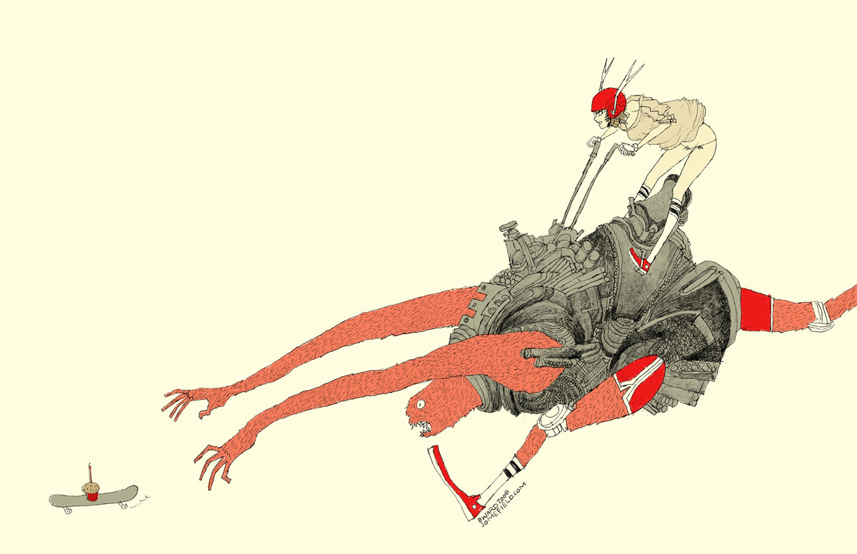
wave goodbye to 2010 with barnaby ward from barbados! he is the talented illustrator behind somefield, a magical place filled with liney ladies cradling insects. i am in love with his minimal backgrounds and exciting flashes of color. there are far too many wonderful pieces to list all of my favorites, but here are the top three: 1 | 2 | 3. you can purchase prints here or here, and for a little desktop joy, click here.


1—midnight misregistration
2—the sad eggplant
3—someone put lipstick on the cat’s butt again
4—suffocating silt cloud
5—bronchitis is gross

Sunday, October 17

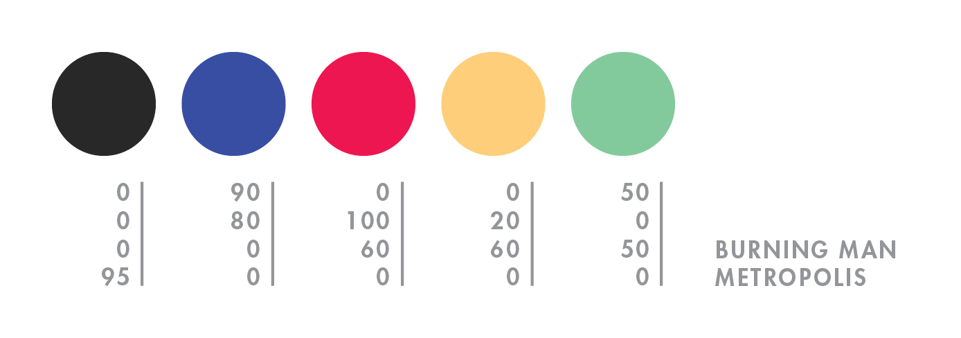
burning man

hello mid-october. it feels like i just returned from burning man, but NO—it was over a month ago! what a slacker i am. to explain burning man to someone who has never been is painful and damn near impossible (for me, at least). so here’s a quick visual re-cap of this year’s burn:


day 1—waited in the longest (and most exhilarating) line of my life.

day 2—move in + rain! + rare supernumerary double rainbow.

day 3—campmate sleeps + first view of the temple + silly self portrait + campmate porta anxiety + party time + bliss dance + deutsch hilarity + happy glow.

day 4—biking with campmate + frolicking in my bloomers (thanks mom) + up all night + dodge a dragon + bubble sunrise + sigh

day 5—alien sighting at center camp + sensory overload + meet martin + temple snuggling + middle of nowhere + surprise! 4am grilled cheese under the stars + stumbling home in the dark.

day 6—raining skydivers + one last ride out to the man + waved goodbye to the lamplighters.

for a wonderful literary description of burning man, here’s the best i’ve read by robin esrock.

Thursday, September 9

randy polumbo

while i organize my thoughts from this year’s burn, here’s a fond memory from 2008:

i was biking through the playa at midnight when i came across a colorful garden of glowing sex toys*. it was a solar-powered art installation by randy polumbo, a pioneer for off-the-grid living. polumbo’s art was the talk of many that year, as it bobbled slightly in the cool desert breeze. you can view additional work by visiting randy’s website. AND for my favorite part—go here > videos > the grotto and garden of manifest destiny to see randy talk about his art and his experience at burning man.


*photo compliments of stargazer95050.

Tuesday, July 27

elodie rambaud

everything elodie rambaud touches turns to pretty. in addition to her eye for color and detail, this french stylist has such a charming sense of composition, and much of her work features FOOD—even better! you may want to grab a snack—favorite elodie stylings include pea chervil, blueberries, and meringue. if you’re a fan of interiors, don’t miss her interior styling portfolio.


p.s. who knew that particular yellow would look SO good next to that pink?

Sunday, July 11

cynthia ona innis

what i find most compelling about the work of cynthia ona innis is the way she captures the flourishing minutia of life. i have been admiring her work for some time, but last month i was able to view it in person at the sf fine art fair— the online photos simply do not do her justice. my favorite pieces include tug, fugitive, and power plant. if you’ll be in los angeles this november, be sure to attend her show at the walter maciel gallery!


i worked with summertime childhood memories to come up with these colors. growing up near the beach & bay in san diego, the colors of the water kept coming to mind. then there are a few other colors: my mom’s (paint-peeling) car in the 70s/80s and this bubblegum ice cream they made by hand at ocean beach.

Friday, March 19

rilla alexander

guten nacht! tonight i bring you rilla alexander, an australian illustrator who lives and works in berlin. she is incredibly talented and quite hilarious, which i discovered while reading about anthropomorphized pets on her blog. her illustrations are equally entertaining—i especially enjoy the unique shapes and organic linework. my favorite rilla projects include sozi as little red cap, a voyage to the valley, and sleep seasons room—what a fantastic place!


i chose the colours of the 2010 studio on fire calendar which i contributed to (alongside other illustrators like brian gunderson, cecilie ellefsen and little friends of printmaking). every year studio on fire letterpress these luscious calendars in wonderful colour combinations that are unlike the palettes i usually pick. because, to be honest, i would be happy to only ever work in one colour—red (or c:0 m:100 y:100 k:10 to be precise).

Wednesday, March 10

blogiversary

AHH…i just realized that today is my one-year blogiversary—how exciting! exactly one year ago today i started collecting cmyk colors. i am thrilled at how many wonderfully-creative people decided to participate! i love watching for parallels between the colors and a person’s life, and in some cases, the shock of finding the complete opposite. i think one’s color palette is not unlike their shoes—it says so much about them.


here is a look at my colors from a year ago…not much has changed.

Monday, February 15

katie kirk

illustrator, katie kirk is a master of the bézier curve. she successfully simplifies complex ideas and turns them into light-hearted vector fun. my favorites include queen pattern, head, and birds. also, be sure to check out her soon-to-be-published book, eli, no!


i chose the colors from this. not really sure why—they just seemed fun ;)

Sunday, February 14

heart day

i like valentine’s day. growing up, my mom always bought me thoughtful little pink and red gifts. also—chocolate and stunning paper products! okay, so those are all consumer-based, but i think i’m okay with that. if i could only shop on one day, it would be valentine’s day. plus, the alternative is being one of those cynical anti-valentine* types, and i’m far too happy to venture down that road just yet. i hope you had a happy heart day, and if not you still have time to buy yourself a candy bar and cry yourself to sleep on the sofa.


green & black’s toffee milk chocolate | roses downtown | my pink t-shirt

*sorry anti-valentiners. i enjoy your rants on the bad days.

Friday, February 5

27th birthday

i wrote this to remember what i was thinking on my 27th birthday. since moving to san francisco (2005), my life has been filled with exciting new challenges—grad school (2006 to 2008), this color blog (2008), a return to freelance (2009), and a trip to the other side of the planet (2009). 2010 has barely begun, yet i feel aimless and uncertain. perhaps it’s because i haven’t made any specific goals, or it could be that my husband recently finished school and is looking for work. we are uniquely connected so his dismal results could definitely be contributing to my recent state of ennui. it might also be my inability to choose a vocation. i want to learn, create, and help, but i do so many different things that i am often at a loss as to where to begin and what i should really be doing.


i had to get out, so i hopped on the closest bus and took off toward golden gate park. i filled my day photographing bits of the park and the many flora at the conservatory of flowers. i finished the day with a giant burrito and a slice of vegan chocolate cake. although it didn’t cure my current state of mind, it did remind me that even though i’m not my usual happy-as-a-clam self, i still have the ability to create, and that’s something worth celebrating.

Monday, February 1

neely jacobson

i recently reconnected with neely jacobson, one of the kindest and funniest people i remember from high school. these days she is one talented photographer. all of her photos are gorgeous, but i keep returning to the portraits. her wonderful personality must put people at ease because she is able to capture the sincerest expressions. my faves include jillian + james, kendi, maple rings, jeramie jump, and most of all, this one of her little girl, drew.


they just look like colors that would taste good. they make sense to me. i LOVE the mustardy-olivey green colors. i never get tired of that color. and the coral pink reminds me of my daughter drew for some reason. the turquoise reminds me of california (my favorite place away from home) and the grayish color looks real, innocent, soft, old, classic, calming, and homey to me.

Monday, January 25

elsa mora

wow, where do i begin? elsa mora, aka elsita, is a cuban-born artist whose talent exceeds classification. i knew of her first as a paper artist, responsible for perfectly-curved edges and the conceptually-brilliant paper sculpture, fears, and el corazon. more recently, i’ve been following her—GASP personal style, which has left me equally enchanted and a tad underdressed. her creations span all media—here, a few of my favorite gems: el jardin de maria julia, missing garden, mimi, unlimited flower protection, felted necklace, emanuel, her way, uchi…i really could go on forever. OH, and did i mention her new book?! for updates on all things elsita or to purchase her lovely creations, stop by her main blog.


here i did a selection of colors that i love. but the truth is that i love all the colors in the rainbow. to me each color is a door to a new world, each one of them has a personality, a language and i’m always curious to see what they “have to say”.

Wednesday, January 13

lindsey manwell

lindsey manwell is a san francisco children’s book illustrator who creates some of the most enchanting scenes. her soft little characters appear to lead such charmed lives. my favorite illustrations include windup, tort, shelf, and one of her new characters, wart. you can follow her blog for recent work and activities.


i don’t really know why anyone is drawn to the colors that they are drawn to, but i do know that the most emotion for me, from any picture, comes from the color compilation. i’ll never forget seeing sargent’s fumée d’ambre gris—it was perhaps this image that made me become an artist all together, it was that powerful. i tend towards lighter, muted colors all over with highlights of deep, rich color.

Tuesday, January 5

romain philippon

i find romain philippon’s inconscience incredibly captivating. i love examining the photos for trinkets and other clues to personality and profession, while the owners lie sleeping. i enjoy seeing people through romain’s eyes—everyone is so real, yet hopeful. other favorites include a0003b, a0018, and a0007. romain lives in réunion, an island amidst the indian ocean. for inspiration, check out his blog.


to me these colors mean asia, africa, europe, south america, and reunion island (where i live).

Sunday, January 3

tiffany shih

tiffany shih designed the most fantastic bra packaging i've ever seen. what i wouldn’t give to be an apple. i am also fond of her how to be a texan poster, which you can use to make your own hat—yeehaw! i can’t wait to see what this girl comes up with post-graduation.


my work tends to be obnoxiously bright, bold and loud. i think it’s very reflective of my personality—not to say that i annoy everyone that i come across (although friends and family might say otherwise), but i’m not afraid to be goofy and sing loudly on the streets if i feel the sudden urge to. i’ve also been told by the roommates that they can hear me laughing in my room through the window from a couple of streets away.

…yeah…i’m one of those people.

Sunday, December 6

cate anevski

cate anevski is a creative extraordinaire that i found on flickr…back in march! for some reason we keep losing each other in the interwebs. i email her, she emails me, i never get it, i email again, she emails me, i bury the email in my box—no more of this—it is time! what i love most about cate’s work is her charming outlook on the world. her unique style is present in every medium she uses. my favorite illustration work includes celtic knot, marie antoinette, and elemental nymphs, which are now available in cate’s etsy shop! i’m also a fan of her eleven-eyed monster and leet embroidery skills. for recent work, updates, and all things worth doing in portland, stop by her blog.


i have recently undergone my first portland, oregon, winter, and the gray weather left me a bit starved for the warm colors of the sun. my latest illustrations reflect this with a bright pink and orange palette.

Friday, November 27

black friday

oh black friday, i’ve easily ignored you in the past, but this year i made an exception…for bras. shopping is one of my least favorite activities, especially if it’s for something i have to wear because i’m incredibly picky with a side of freakish proportions. however, this year i just happen to live within two blocks of macy’s, so i got dressed and left the house around 4:30am. i had some coffee, compliments of macy’s, watched all the cute girls coo in front of the window, and mentally prepared myself for what was to come. finally, they plugged in the last bit of neon and opened the doors. we were greeted by a very authentic rosy-cheeked mr. and mrs. claus as everyone flocked downstairs to make-up and housewares. i escalated to the 5th floor, grabbed a handful of bras that were close to my size, and entered the fitting room. a very small woman yelled at me from outside—YOU LIKE? well…not really. GIVE ME SIZE, I FIND YOU GOOD ONES. she passed a handful back to me…UGLY, BUT COMFORTABLE…YOU TRY! ok, ok. they were very lacy, and quite the opposite of my tastes, but they felt like silky magic on. so i bought three for $50. the end.


macy’s windows | mr. & mrs. claus | bra | bra | bra

Monday, October 19

michelle ‘milo’ white

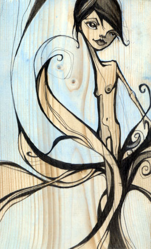
michelle ‘milo’ white is a line-lovin’ lady who uses graphite and acrylics to create unique, angular characters. my favorite part about her work is the way she renders faces, carving them out piece by piece like a wooden sculpture. i am fond of tree, nymph, memories, shin bone, and twin. be sure to check milo’s blog for new work.


i’m a san francisco illustrator who’s crazy about line work. i use color in a supporting role…very little…just a pop of pink to breathe some life into a piece. i love architect’s handwriting, blueprints and wood grain. my colors may appear subtle but they are accompanied by a heavy hand of black ink. the juxtaposition of the two brings me balance.

Sunday, October 18

jennifer davis

i was ecstatic when i stumbled upon the work of artist, jennifer davis. her colors are so unique. she uses soft linework and surrounds her charming cast of characters with magical environments filled with balloons and bits of nature. because she works with such a serene palette, her paintings feel even more special when she adds a bright color. the paintings i enjoy most are sea lions, sent, refrain, remember, catharsis and listen. visit her blog for new paintings and show info.