Showing posts with label purple. Show all posts

Monday, February 28

elisa zeppilli

elisa zeppilli is the talent behind fluttuo, a refreshingly-original collection of jewelry that makes me giddy. elisa hand-picks the materials during her frequent travels through europe and the united states. my favorite fluttuo pieces from the 2011 collection include meryl & isabelle. from the 2010 birthday collection, i love this little daisy bracelet. go discover your favorites, and be sure to find fluttuo on facebook for photos and updates on new collections!


i took these colors from the original fluttuo logo because they represent the beginning of my passion. i started fluttuo because i needed to do something that i really felt was mine—i needed to free myself, my creativity and make something beautiful and really unique with my own hands.

the name fluttuo (i float, in italian) was born from the idea that wearing a fluttuo creation would make you feel happy and light almost like floating in the air. all the fluttuo pieces are unrepeatable. this means that every woman who chooses a fluttuo design will be the only one to own and wear it. i think it's important for each of us to find ourselves the way we really are, without following trends, but choosing our own style and soul.

Friday, December 31

barnaby ward

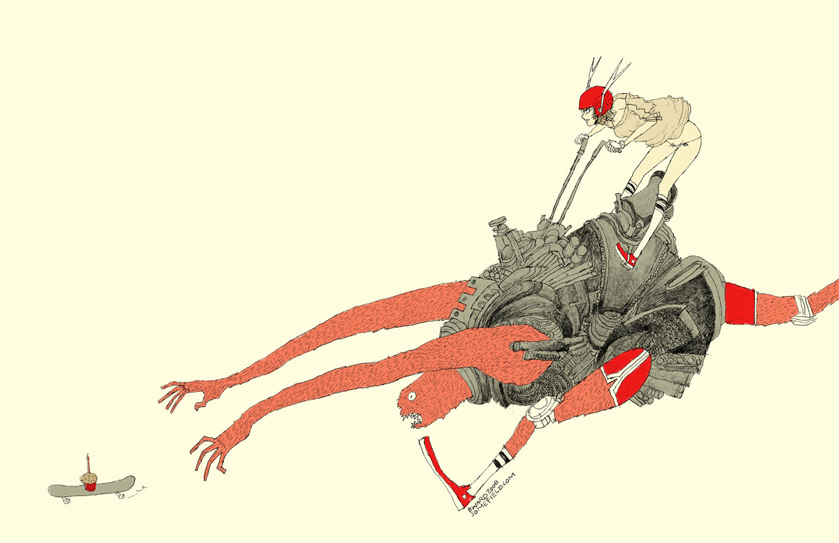
wave goodbye to 2010 with barnaby ward from barbados! he is the talented illustrator behind somefield, a magical place filled with liney ladies cradling insects. i am in love with his minimal backgrounds and exciting flashes of color. there are far too many wonderful pieces to list all of my favorites, but here are the top three: 1 | 2 | 3. you can purchase prints here or here, and for a little desktop joy, click here.


1—midnight misregistration
2—the sad eggplant
3—someone put lipstick on the cat’s butt again
4—suffocating silt cloud
5—bronchitis is gross

Sunday, October 17

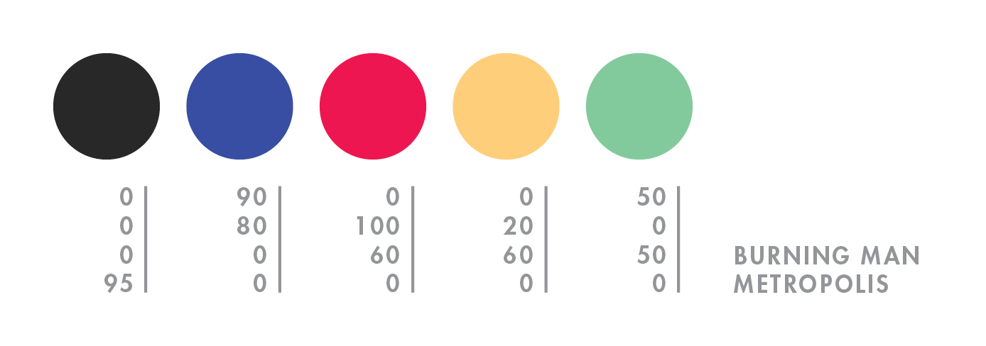
burning man

hello mid-october. it feels like i just returned from burning man, but NO—it was over a month ago! what a slacker i am. to explain burning man to someone who has never been is painful and damn near impossible (for me, at least). so here’s a quick visual re-cap of this year’s burn:


day 1—waited in the longest (and most exhilarating) line of my life.

day 2—move in + rain! + rare supernumerary double rainbow.

day 3—campmate sleeps + first view of the temple + silly self portrait + campmate porta anxiety + party time + bliss dance + deutsch hilarity + happy glow.

day 4—biking with campmate + frolicking in my bloomers (thanks mom) + up all night + dodge a dragon + bubble sunrise + sigh

day 5—alien sighting at center camp + sensory overload + meet martin + temple snuggling + middle of nowhere + surprise! 4am grilled cheese under the stars + stumbling home in the dark.

day 6—raining skydivers + one last ride out to the man + waved goodbye to the lamplighters.

for a wonderful literary description of burning man, here’s the best i’ve read by robin esrock.

Monday, August 2

scott london

scott london is a talented journalist, author, and photographer who has been capturing the magic that is burning man since 2004. black rock city is such a vast, intricate, and indescribably beautiful experience—i am always elated when i stumble upon photographers who have managed to record that beauty forever. here are a few of my favorite moments—blue couple, white stilts, playa nap, and lady in pink. you can read more about scott and his many fascinating adventures here.


1—burning man is set against a backdrop of desert, mountains and sky. its defining feature is the playa—a vast empty canvas for creative self-expression. i love it when the wind kicks up and the entire place is hurled through with dust.

2—watching the sun rise over the black rock mountains is one of life’s most exquisite rewards. the first rays of light are a golden yellow and always inspire a kind of hushed reverie.

3—the skies are never as blue as they are in the black rock desert. in the morning, shortly after sunrise, or in the late afternoon before dusk, i like to drag people out on the playa and make portraits against the soft blue sky.

4—as most burners will tell you, the event only fully comes alive at night when the playa is transformed into a carnival of flashing neon signs, wacky art cars, pyrotechnic displays and pulsing soundscapes. even on a moonless night, the sky is dark blue, alight with stars.

5—the beauty of fire is that it contains within it a remarkable spectrum of colors, from purples and reds to oranges and yellows. when the man goes up in flames toward the end of the event, the heat from the fire is so intense you can feel it a half-mile away and so bright you need sunglasses. a dazzling spectacle.

Sunday, June 27

san francisco pride

i scored a sweet spot on market street at third. it was oddly warm and completely fog-free. i fiddled with my camera in an attempt to distract myself from the annoyingly oblivious, yet cute italian tourists that kept stepping on my blanket and kneeing me in the back. initially things were very exciting—dykes on bikes, fancy ladies, and a vegan pig, but the sf pride parade is incredibly LONG, and i only lasted one hour before i had to make a pit stop at the palace. naturally i lost my spot so i herded underground to hop on muni toward the civic center; however, i was not prepared for that amount of choas DURING the parade, so i reversed course and started walking, or rather skillfully darting to protect my camera from the sloshing fountains of beer. i made it to the civic center in about 30 minutes, at which point i decided i couldn’t possibly carry around my bag ALL afternoon. i walked home, relaxed for a bit, and then walked back. i have no idea what time that was, but the parade was still blasting! this time i was unable to cope with the madness so i started drinking (thank you for the free shots!), which was an excellent decision as i ended up with some garlic fries, annihilating a chicken kabob (completely uncharacteristic of me), and doing a trance dance (also atypical) with a group of local femmes. i staggered home for the second time and collapsed on my futon, which is when i discovered that i'd only taken 25 mediocre photos—FAIL! aw, well…40 & fabulous! i hope i’m that much fun when i turn 40.

Tuesday, March 16

thea schrack

thea schrack is a san francisco photographer and encaustic painter. i wasn’t familiar with encaustic painting prior to viewing her work—the process involves adding colored pigments to hot beezwax, which is then applied to the surface. what i love most about thea’s work is the distinct atmospheric presence—each piece leaves me with a nostalgic, dream-like feeling. some of my favorites include small bird, redwing blackbird 2, magnolia 1, red branches 1, and blue weeds. you can find recent work and inspiration on thea’s blog.


that was really fun, and a surprising color combination for me. i picked colors from forest tapestry, a piece that is on my blog.

Wednesday, January 13

lindsey manwell

lindsey manwell is a san francisco children’s book illustrator who creates some of the most enchanting scenes. her soft little characters appear to lead such charmed lives. my favorite illustrations include windup, tort, shelf, and one of her new characters, wart. you can follow her blog for recent work and activities.


i don’t really know why anyone is drawn to the colors that they are drawn to, but i do know that the most emotion for me, from any picture, comes from the color compilation. i’ll never forget seeing sargent’s fumée d’ambre gris—it was perhaps this image that made me become an artist all together, it was that powerful. i tend towards lighter, muted colors all over with highlights of deep, rich color.

Sunday, October 18

jennifer davis

i was ecstatic when i stumbled upon the work of artist, jennifer davis. her colors are so unique. she uses soft linework and surrounds her charming cast of characters with magical environments filled with balloons and bits of nature. because she works with such a serene palette, her paintings feel even more special when she adds a bright color. the paintings i enjoy most are sea lions, sent, refrain, remember, catharsis and listen. visit her blog for new paintings and show info.

Friday, October 16

frank chimero

today i bring you frank chimero, a super-talented illustrator, designer, and writer. frank is full of ideas, and he is pro at concise communication. i love his life and design poster, state illustrations, and monster tee most of all. AND in addition to his extremely entertaining blog, he also co-writes questionable characters with ben barry. go get some answers!


so i’m sitting at a table with a full setting for myself and a few good friends. i’m on a trip in the san juan islands, a couple of small blobs of land poking out of the puget sound thanks to some geographic anomaly. there’s a huge set of windows to my right. if i look out, i have a view of all the other tree-speckled islands, which fade off in a blue atmospheric haze. it’s clear today, and it feels like i can stare out forever. also, this napkin is yellow and orange and purple.

Sunday, September 20

64 colors

64 colors is an extremely talented pair of creatives named laura and eric. you may know them if you are active in the toy scene. their little marshall has traveled all over—here he is in tokyo! in addition to toys, 64 colors also designs prints and paints wonderful worlds that feature their characters. some of my favorite prints are miso tippy and noodles, which i appreciate even more now that they are a daily part of my diet in japan. the paintings i cant get enough of are control freak, sweet dreams, toast, and destination unknown. if you love 64 colors and need a place to sketch, you should check out their new artist chubby book, which is now available on pinkghost!

and, as you can imagine, with a name like 64 colors it was
torture choosing just 5, so they would like to add a lovely black—
60 | 70 | 70 | 70—to the palette below.


our version of a soft palette, picked from 50/60s books and prints. we really need 6 colors to complete our set. break the rules!

Wednesday, September 2

asaborake

konnichiwa from japan! its taken me quite a while to complete this post as i have been enchanted and distracted by this lovely island nation, but here goes—enjoy!

asaborake is run by two sisters—junko dono, who lives in japan and mari, who lives in orange county. junko dono designs and hand-makes these gorgeous bags out of kimonos and leather, while mari handles all of the important miscellaneous details that arise with a new company. some of my favorite pieces include the pen case, expression bag, and small tote bag. for new items and other interesting commentary, check out asaborakes blog.


from junko dono:
1—i believe i look the best in this color?! it is a cool color, but also gives me warmth. 2—good to blend this color into my skin color. 3—color of denim / aizome (japanese traditional indigo-dyeing). my basic color. 4—color of the sun. i like to put this color on denim. 5—the color of forest.

from mari:
by the way, i saw your plan to travel to japan. it sounds really exciting! japan is full of colors!!! i like the colors being used in old shrines and temples, and the color of the surrounding nature. i hope you can find very special colors in japan! have a nice trip!

Thursday, August 13

stefano bonazzi

the work of italian digital artist, stefano bonazzi is dark and stunning. his subjects and their environments are eerily charming. bonazzi uses a combination of charcoal, digital photography, and photo retouching to bring his surreal world to life. i cant look away from the last day on earth, part i. i am also fond of dreamland and le sorelle attesa from bonazzis nonsense series. and, for those who prefer high-key, here is a unique untitled piece.


i think these colors represent me and my vision of the world. they are unusual and hard to find in nature—this is why i like them.

Sunday, August 2

eika dopludo

russian artist, eika dopludo is responsible for all sorts of innovative creations, including this inspirational poster project—i get so excited when i stumble upon messages such as these. eika also does beautifully intricate pencil drawings—hair abstraction and in love are my favs. and if youre a fan of interior design, take a look at these stunning wall and pillow projects. here is one fun final link because i cannot deny a monster.


my lips | night sky | the sea | my husbands eyes | how i feel now

Friday, July 31

simon page

simon page is a designer and self-proclaimed technophile from the uk. his use of pattern, shape, and repetition is stunning. my favorite series is colourful universe, which combines all of the above mentioned elements with color! simon has also designed numerous logos and other wonderful bits of typography, such as this hard to read series—i do love a challenge. go see how many you can decipher.


the first colour is a colour i have been using for my latest tron poster and have come fond of. the rest are just my favourite colours overall.

Saturday, July 11

giulia santopadre

designer, giulia santopadre, gave me some much-needed typographic resuscitation. i am in love with her fresh take on all things type, especially her nerd glasses packaging, grow your own designer lettering, and finally this hot vice ambigram.


they just came to me.

Thursday, June 25

mayuko fujino

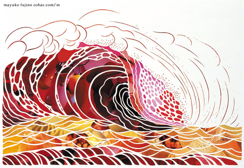
mayuko fujino creates some of the most gorgeous paper collages i’ve ever seen. i love the composition, shapes, color, subject—everything. my favorite piece is heavenly bodies #17, but other notables include heavenly bodies #5, black hummingbird, red wave, and this recent piece from mayuko’s upcoming solo show—the day of the sea (海の日 / umi no hi). the show opens in tokyo on july 20th. i hope to see some of mayuko’s work when i visit japan this september!


currently i’ve been working on new pieces for my solo show in july, and i use colors like these very often lately. i’m in the mood for these.

Monday, June 22

june leeloo

flowers were the first love of artist, june leeloo. she dreamt of traveling the world as a botanist, yet happily ended up a painter. my absolute favorite leeloo piece is hatsuharu. i’m also fond of the peaceful sayoko, which you can see in person at the black maria gallery in los angeles through july 11th along with two other lovely leeloo pieces.


they are the colours i use the most, my very favourite ones.

Wednesday, June 10

igor dukic

igor dukic creates vector illustrations that feel original and impulsive. i am especially fond of these flowers, bleeding for help, and this silly holiday monkey. dukic also has an extensive icons portfolio—favs include bgreen, mosaic, and these loving pets.


dukics color palette was inspired by this recent illustration.

igor, better know as pez because of his long neck and large adams apple, comes from hills of central bosnia. let me lift my head and offer you a candy. i found myself through my art, i hope i can help you find you!

Tuesday, June 9

josh kenyon

josh kenyon has found the perfect balance of design and illustration.
i absolutely love this wedding invitationthis one too! his diverse
portfolio is filled with all kinds of fun, including guitars and this
coveted bathroom.


i have pretty much only been designing in these colors for the past couple months. i am currently working on a zine/show with colby nichols under our collaboration name JOLBY. i know its a wacky palette but it was something that made me smile. i think thats how i always pick colors.

Monday, June 1

lawrence yang

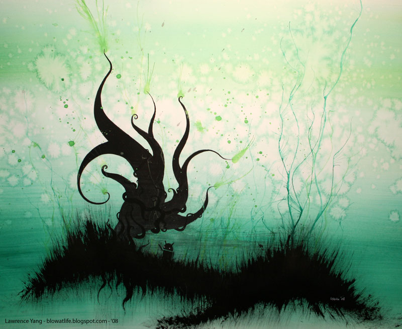
i am currently fascinated by san francisco artist, lawrence yang. i love watching his ink, marker, and watercolor paintings come alive—you can view his work daily on his blog! i am loving mario apocalypse, sideshow, and tree droid. i cant wait to see his paintings in person at gallery 1988 next month.


it was hard to pick just five colors!