Sunday, May 22

artpadsf

i just returned from the most thrilling art fair! actually, there were three this weekend: sf fine art fair, artmrkt, and artpadsf. the latter was my favorite. the first bit of awesome was the venue—the famed 50s-style phoenix hotel, located in the hottest art hood—the tenderloin. each of the participating galleries filled their glass-front hotel room with art and personal flair. the experience was uniquely san francisco, and each room reminded me of a different part of the city. they were playing good music next to a pool-side bar, all surrounded by mind-blowing art. i hope this event was successful enough to become a repeat occurrence.

Monday, February 28

elisa zeppilli

elisa zeppilli is the talent behind fluttuo, a refreshingly-original collection of jewelry that makes me giddy. elisa hand-picks the materials during her frequent travels through europe and the united states. my favorite fluttuo pieces from the 2011 collection include meryl & isabelle. from the 2010 birthday collection, i love this little daisy bracelet. go discover your favorites, and be sure to find fluttuo on facebook for photos and updates on new collections!


i took these colors from the original fluttuo logo because they represent the beginning of my passion. i started fluttuo because i needed to do something that i really felt was mine—i needed to free myself, my creativity and make something beautiful and really unique with my own hands.

the name fluttuo (i float, in italian) was born from the idea that wearing a fluttuo creation would make you feel happy and light almost like floating in the air. all the fluttuo pieces are unrepeatable. this means that every woman who chooses a fluttuo design will be the only one to own and wear it. i think it's important for each of us to find ourselves the way we really are, without following trends, but choosing our own style and soul.

Friday, December 31

barnaby ward

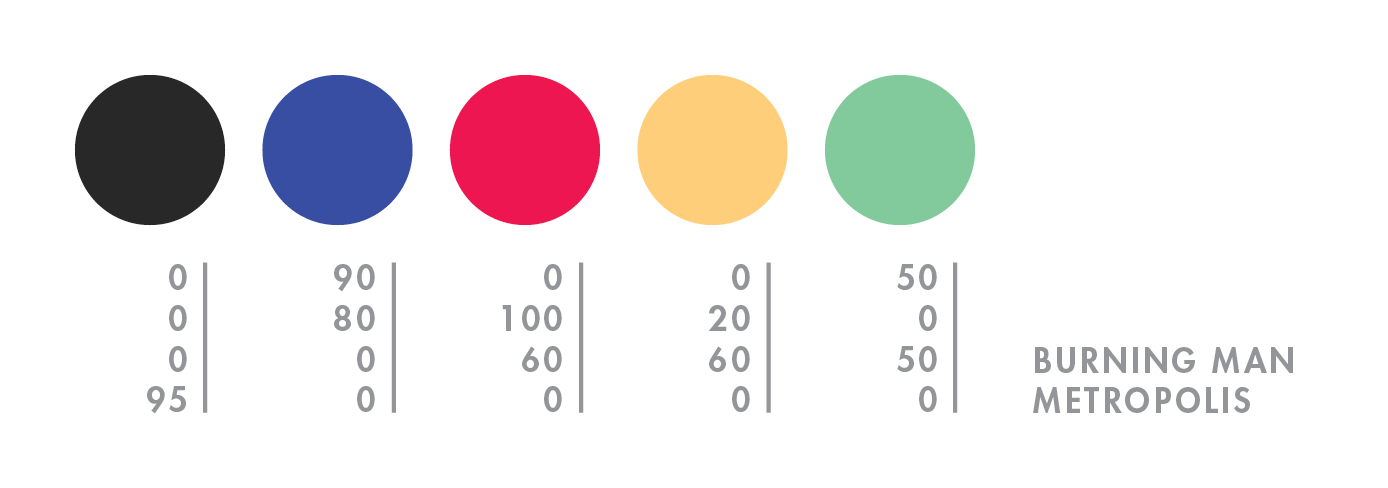
wave goodbye to 2010 with 
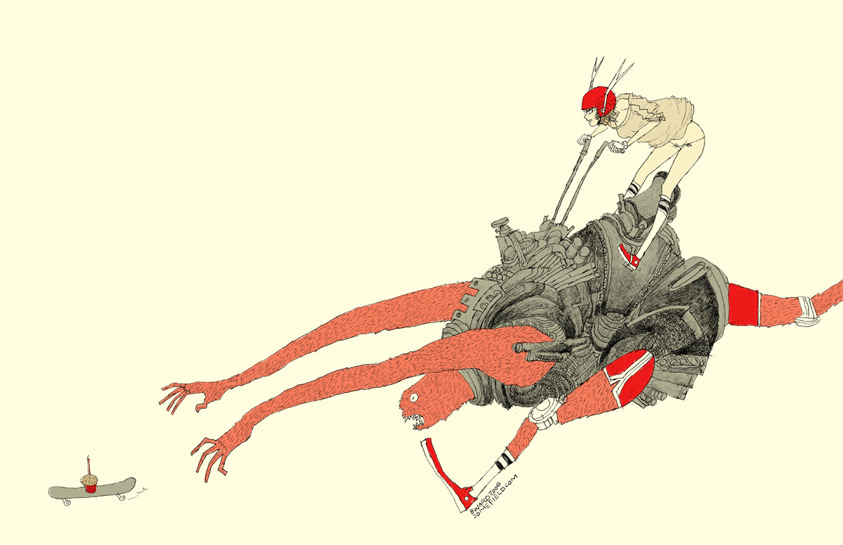
barnaby ward from barbados! he is the talented illustrator behind somefield, a magical place filled with liney ladies cradling insects. i am in love with his minimal backgrounds and exciting flashes of color. there are far too many wonderful pieces to list all of my favorites, but here are the top three: 1 | 2 | 3. you can purchase prints here or here, and for a little desktop joy, click here.


1—midnight misregistration
2—the sad eggplant
3—someone put lipstick on the cat’s butt again
4—suffocating silt cloud
5—bronchitis is gross

Tuesday, December 28

diego gravinese

soft frost comes to mind when i view the work of diego gravinese. the argentinian painter captures intimate moments in a wonderfully cold way. i find the layered compositions and cool palette calming, yet engaging. the paintings i enjoy most are milk girl, las leyes naturales, and my favorite thoughts (when i feel like a woman). also, be sure to check out gravinese’s older work so you can experience the interesting progression of his art.


1—the main color in milk girl. i love it because it is reminiscent of childhood memories—those light teal tiles of 70s kitchens.

2—the color of faded skies according to kodak slides.

3—skin. the central tone of the solar system in my paintings.

4—some sort of undefined grey. shadows are made of a mix of all the surrounding colors, and i love greys and non-colors for that same reason.

5—red. my favorite color.

Tuesday, October 19

dana oldfather

dana oldfather’s progressive colors and organic forms inspire feelings of quiet euphoria. unknown creatures reminiscent of space and sea float about in a delightful mess of oils, alkyd & marker. among my favorites are feeding, candy coated couch, waking, and this lovely minaret print from little paper planes. you can view her studio (always fun for me), paintings in progress, and show updates on her blog.

dana chose these colors from crowning fire, a new painting, which will be on display november 19th through december 31st at the bonfoey gallery in cleveland, ohio.


in art i have always tried to connect to the world through beauty. each work is an attempt to elegantly express the embodiment of paradox; a physical manifestation of conflicting desires communicated in an abstract arrangement of forms.

Sunday, October 17

burning man

hello mid-october. it feels like i just returned from burning man, but NO—it was over a month ago! what a slacker i am. to explain burning man to someone who has never been is painful and damn near impossible (for me, at least). so here’s a quick visual re-cap of this year’s burn:


day 1—waited in the longest (and most exhilarating) line of my life.

day 2—move in + rain! + rare supernumerary double rainbow.

day 3—campmate sleeps + first view of the temple + silly self portrait + campmate porta anxiety + party time + bliss dance + deutsch hilarity + happy glow.

day 4—biking with campmate + frolicking in my bloomers (thanks mom) + up all night + dodge a dragon + bubble sunrise + sigh

day 5—alien sighting at center camp + sensory overload + meet martin + temple snuggling + middle of nowhere + surprise! 4am grilled cheese under the stars + stumbling home in the dark.

day 6—raining skydivers + one last ride out to the man + waved goodbye to the lamplighters.

for a wonderful literary description of burning man, here’s the best i’ve read by robin esrock.

Friday, September 10

christopher michel

who needs color with christopher michel around?! okay, that’s crazy talk coming from me, but you’ll understand as soon as you click here, here, and also here. the clarity, contrast, and composition—SO spectacular! now back to my senses. here’s some hot color action like you’re used to, both lady & man. christopher is more than just a talented photographer—you can read about his other endeavors here.


the 4 blue shades were chosen to represent the linear progression of people throughout their lives while the offset green box represents those who have chosen an altogether different path. i’m reminded of apple’s famous ad.