Showing posts with label gray. Show all posts

Tuesday, December 28

diego gravinese

soft frost comes to mind when i view the work of diego gravinese. the argentinian painter captures intimate moments in a wonderfully cold way. i find the layered compositions and cool palette calming, yet engaging. the paintings i enjoy most are milk girl, las leyes naturales, and my favorite thoughts (when i feel like a woman). also, be sure to check out gravinese’s older work so you can experience the interesting progression of his art.


1—the main color in milk girl. i love it because it is reminiscent of childhood memories—those light teal tiles of 70s kitchens.

2—the color of faded skies according to kodak slides.

3—skin. the central tone of the solar system in my paintings.

4—some sort of undefined grey. shadows are made of a mix of all the surrounding colors, and i love greys and non-colors for that same reason.

5—red. my favorite color.

Sunday, October 17

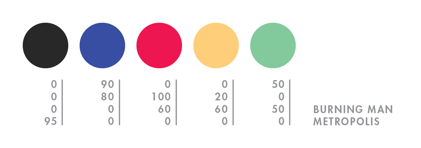
burning man

hello mid-october. it feels like i just returned from burning man, but NO—it was over a month ago! what a slacker i am. to explain burning man to someone who has never been is painful and damn near impossible (for me, at least). so here’s a quick visual re-cap of this year’s burn:


day 1—waited in the longest (and most exhilarating) line of my life.

day 2—move in + rain! + rare supernumerary double rainbow.

day 3—campmate sleeps + first view of the temple + silly self portrait + campmate porta anxiety + party time + bliss dance + deutsch hilarity + happy glow.

day 4—biking with campmate + frolicking in my bloomers (thanks mom) + up all night + dodge a dragon + bubble sunrise + sigh…

day 5—alien sighting at center camp + sensory overload + meet martin + temple snuggling + middle of nowhere + surprise! 4am grilled cheese under the stars + stumbling home in the dark.

day 6—raining skydivers + one last ride out to the man + waved goodbye to the lamplighters.

for a wonderful literary description of burning man, here’s the best i’ve read by robin esrock.

Tuesday, July 27

elodie rambaud

everything elodie rambaud touches turns to pretty. in addition to her eye for color and detail, this french stylist has such a charming sense of composition, and much of her work features FOOD—even better! you may want to grab a snack—favorite elodie stylings include pea chervil, blueberries, and meringue. if you’re a fan of interiors, don’t miss her interior styling portfolio.


p.s. who knew that particular yellow would look SO good next to that pink?

Wednesday, June 16

jean-luc picard

i will be the judge of what is reasonable! in celebration of captain picard day, i bring you mon capitán in cmyk. every night my husband and i meet on the couch…er, futon for an episode or two of star trek > tng before bed. it’s one of the few activities we both enjoy, and i’m sure we’ll still be watching when we’re 80.


favorite picard quotes:
1—the line must be drawn here—this far and no further!
2—villains who twirl their mustaches are easy to spot. those who clothe themselves in good deeds are well camouflaged, waiting for the right climate in which to flourish, spreading fear in the name of righteousness.
3—tea, earl grey, hot.

Sunday, April 18

jez burrows

jez burrows, designer and illustrator, uses colors that make my heart sing, and when you pair that with infographics i get a little giddy. my favorites include instal 09, celestial feats, and the modern listener’s guide—screenprint available in his shop! you can also find burrows over at sing statistics, the independent publishing concern he runs with illustrator, lizzy stewart.


here are five colours that make up my print for kitsune noir’s poster club earlier this year, based on thoreau’s walden. they’re currently quite fresh in my mind as i’ve just had a screen printed version of the print made, that should be available soon*. i really need to quit using the second green in things.

*update: they are available now!

Sunday, April 11

danny thompson

danny thompson is a talented designer, currently based in dallas. his work is striking, clean, and warm—all of the things i love to see in design. his kimberly harper website and usps annual report are two wonderful examples of this, but it was this illustration of bob dylan that first caught my eye on behance. i am also a fan of his camera work. to see more of danny’s creations, go check out his new website!


i draw lots of inspiration from the natural weathering of things from the past. with varying shades of brown, this palette has always worked well for me. the red/maroon works great as an eye catcher amid the neutral colors.

Tuesday, March 16

thea schrack

thea schrack is a san francisco photographer and encaustic painter. i wasn’t familiar with encaustic painting prior to viewing her work—the process involves adding colored pigments to hot beezwax, which is then applied to the surface. what i love most about thea’s work is the distinct atmospheric presence—each piece leaves me with a nostalgic, dream-like feeling. some of my favorites include small bird, redwing blackbird 2, magnolia 1, red branches 1, and blue weeds. you can find recent work and inspiration on thea’s blog.


that was really fun, and a surprising color combination for me. i picked colors from forest tapestry, a piece that is on my blog.

Wednesday, March 10

blogiversary

AHH…i just realized that today is my one-year blogiversary—how exciting! exactly one year ago today i started collecting cmyk colors. i am thrilled at how many wonderfully-creative people decided to participate! i love watching for parallels between the colors and a person’s life, and in some cases, the shock of finding the complete opposite. i think one’s color palette is not unlike their shoes—it says so much about them.


here is a look at my colors from a year ago…not much has changed.

Monday, February 15

katie kirk

illustrator, katie kirk is a master of the bézier curve. she successfully simplifies complex ideas and turns them into light-hearted vector fun. my favorites include queen pattern, head, and birds. also, be sure to check out her soon-to-be-published book, eli, no!


i chose the colors from this. not really sure why—they just seemed fun ;)

Monday, February 1

neely jacobson

i recently reconnected with neely jacobson, one of the kindest and funniest people i remember from high school. these days she is one talented photographer. all of her photos are gorgeous, but i keep returning to the portraits. her wonderful personality must put people at ease because she is able to capture the sincerest expressions. my faves include jillian + james, kendi, maple rings, jeramie jump, and most of all, this one of her little girl, drew.


they just look like colors that would taste good. they make sense to me. i LOVE the mustardy-olivey green colors. i never get tired of that color. and the coral pink reminds me of my daughter drew for some reason. the turquoise reminds me of california (my favorite place away from home) and the grayish color looks real, innocent, soft, old, classic, calming, and homey to me.

Monday, January 4

monina velarde

monina velarde is a chicago-based graphic designer who recently won
the aiga command x competition—congratulations! i am a fan of her lift airlines identity, this superfun new year’s resolution generator, and cleanse packaging, which you can view on her site. you can follow monina’s work…and possibly score some tasty-looking baked goods
on her blog!


one of my favorite projects that i’ve gotten to work on was designing the identity for the kansas city art institute school of design. i worked on it
with my good friend, jessica bayer. we took the basic elements of swiss design, the fundamentals of what the kcai design program was founded on, and reinterpreted them to fit within today
’s design culture. we derived our color palette from swiss poster design. the colors used were primary green, yellow, red, blue and black. these colors were then updated by us to fit contemporary design.

Monday, October 19

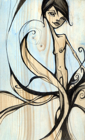
michelle ‘milo’ white

michelle ‘milo’ white is a line-lovin’ lady who uses graphite and acrylics to create unique, angular characters. my favorite part about her work is the way she renders faces, carving them out piece by piece like a wooden sculpture. i am fond of tree, nymph, memories, shin bone, and twin. be sure to check milo’s blog for new work.


i’m a san francisco illustrator who’s crazy about line work. i use color in a supporting role…very little…just a pop of pink to breathe some life into a piece. i love architect’s handwriting, blueprints and wood grain. my colors may appear subtle but they are accompanied by a heavy hand of black ink. the juxtaposition of the two brings me balance.

Sunday, October 18

jennifer davis

i was ecstatic when i stumbled upon the work of artist, jennifer davis. her colors are so unique. she uses soft linework and surrounds her charming cast of characters with magical environments filled with balloons and bits of nature. because she works with such a serene palette, her paintings feel even more special when she adds a bright color. the paintings i enjoy most are sea lions, sent, refrain, remember, catharsis and listen. visit her blog for new paintings and show info.

Saturday, October 17

emil kozak

emil kozak is a versatile designer with an an eye for beautiful repetition. kozak’s soaring vectors and clean, yet complex shapes are just the right amount of detail to complement his delightfully unexpected compositions. favorites include elements spring 09, exhibition gallery, and manual. be sure to check out his shop!


obsessed with water…

Tuesday, September 29

gion

exploring gion’s rain-soaked alleys was a magical experience. the machiya architecture with its lovely lanterns, bamboo inu yarai, and ceramic roof tiles all add to to the mysterious beauty of this well-known geisha district. i was lucky enough to catch a glimpse of both geiko and meiko—two in the back of a black car, and i passed another in a narrow alley. i do not have photos of these encounters as i decided to constrain my gaijin instincts and respect their privacy, but i was excited to find that they are even more stunning and graceful in person. hopefully these traditional artists continue to perform in the future. i have a lot of respect for women who brave the rain in a kimono.


mysterious geiko.

Saturday, September 26

himeji castle

we took a day trip to himeji to see himeji castle, also known as the white heron. it’s the most impressive castle i’ve seen, complete with moat, stoney fortress, super steep stairs, and secret doors. and if that weren’t enough to remember, my first cup of matcha was served at the koko-en garden tea house. it was hot, frothy, and my favorite hue of green. i even learned how to make it using a bamboo chasen! and although my sugar handicap prevented me from sampling the wagashi, i was able to capture the handmade confection forever. banzai!


matcha castle.

Saturday, September 12

tsukiji

i stayed up all night in nearby ginza just to visit the tsukiji fish market—the largest wholesale fish market in the world. i don’t even like seafood, but i HAD to see the tuna auction that takes place from 5 to 6:15am. it was cold, fascinating, and quite disturbing to see the sellers slide the mammoth frozen carcasses around the floor and then jab them with a metal pick. they were bluish silver with a bright pink circle on the back where the tail fin once was. i was in a state of delirium as i stumbled through the rest of the market on my way out, trying to photograph the multitude of sea creatures, many of which were still moving. as far as recommendations, i’d say go if you love to eat fresh seafood, but otherwise the photos will suffice. i say this because we felt like a huge inconvenience to the hundreds of people working that day, from the vendors setting up their stalls to the men racing around on the miniature trucks. and yes, they WILL run you over.


bloodbath on ice.

Monday, September 7

odaiba

we are big fans of odaiba, a large artificial island in tokyo bay. we arrived by a train that runs alongside the rainbow bridge. our first stop was the miraikan (future museum), where we saw our favorite little robot, asimo! another highlight was the real-time weather globe that’s used to explain environmental problems. once we had our science fun, we ended up at yet another arcade—izaak couldn’t have been happier, but he got his later when he accidentally ordered shrimp spaghetti. we rode the hello kitty ferris wheel, watched all the cute dating couples, and ended the evening with a night view of the bay, sprinkled with colorful yakatabune boats.


nerd love.

Sunday, September 6

yanaka

after all of those deafening games and flashing lights, we were ready to see the quieter side of tokyo, so we made our way to the neighborhood of yanaka, located near ueno in the taito ward. first, we stared pensively at the tenno-ji temple. it was sublime until we spotted the giant black ants marching toward us and decided to move it along, through the picturesque yanaka cemetery. then we got lost in a lovely neighborhood and ended up at the choan-ji temple, where we saw an apple tree, mating butterflies, and were bitten by what appeared to be little black and white mosquitoes—they especially loved izaak. it was just enough nature to remind us that we prefer chaos to quiet.


where tanukis frolic.

Monday, August 17

peter sebastian

peter sebastian is the man behind wordboner, a daily source of entertainment for creative folk. peter’s use of typography, clean backgrounds, and a fancy frame commands us to stop, read, think, and sometimes laugh. the wordboners i enjoy most are fuck time, get away with everything, shitstorms, the trick, you die, expect the best, and grudge. find your favs and wear them proudly, or you can write and design your own here!


1—i think my most favorite color of all times. it’s the color of blood, passion, drama, it’s intense and controversial in some way. 2—i’m not keen on pink, but this shade suits me. i don’t use it a lot, i don’t wear it, but this shade is pleasing. 3—i think it’s a very hard color to like, it took me a while, but now it’s one of my favorite ones. 4—i never use too much of this shade in my designs -it’s way too happy and chirpy- but i do love it secretly. i wouldn’t mind having a whole room in intense yellow. 5—all shades of gray have a special place in my heart. i love this one, it’s intense, almost black.