Showing posts with label red. Show all posts

Tuesday, December 28

diego gravinese

soft frost comes to mind when i view the work of diego gravinese. the argentinian painter captures intimate moments in a wonderfully cold way. i find the layered compositions and cool palette calming, yet engaging. the paintings i enjoy most are milk girl, las leyes naturales, and my favorite thoughts (when i feel like a woman). also, be sure to check out gravinese’s older work so you can experience the interesting progression of his art.


1—the main color in milk girl. i love it because it is reminiscent of childhood memories—those light teal tiles of 70s kitchens.

2—the color of faded skies according to kodak slides.

3—skin. the central tone of the solar system in my paintings.

4—some sort of undefined grey. shadows are made of a mix of all the surrounding colors, and i love greys and non-colors for that same reason.

5—red. my favorite color.

Sunday, June 27

san francisco pride

i scored a sweet spot on market street at third. it was oddly warm and completely fog-free. i fiddled with my camera in an attempt to distract myself from the annoyingly oblivious, yet cute italian tourists that kept stepping on my blanket and kneeing me in the back. initially things were very exciting—dykes on bikes, fancy ladies, and a vegan pig, but the sf pride parade is incredibly LONG, and i only lasted one hour before i had to make a pit stop at the palace. naturally i lost my spot so i herded underground to hop on muni toward the civic center; however, i was not prepared for that amount of choas DURING the parade, so i reversed course and started walking, or rather skillfully darting to protect my camera from the sloshing fountains of beer. i made it to the civic center in about 30 minutes, at which point i decided i couldn’t possibly carry around my bag ALL afternoon. i walked home, relaxed for a bit, and then walked back. i have no idea what time that was, but the parade was still blasting! this time i was unable to cope with the madness so i started drinking (thank you for the free shots!), which was an excellent decision as i ended up with some garlic fries, annihilating a chicken kabob (completely uncharacteristic of me), and doing a trance dance (also atypical) with a group of local femmes. i staggered home for the second time and collapsed on my futon, which is when i discovered that i'd only taken 25 mediocre photos—FAIL! aw, well…40 & fabulous! i hope i’m that much fun when i turn 40.

Wednesday, June 16

jean-luc picard

i will be the judge of what is reasonable! in celebration of captain picard day, i bring you mon capitán in cmyk. every night my husband and i meet on the couch…er, futon for an episode or two of star trek > tng before bed. it’s one of the few activities we both enjoy, and i’m sure we’ll still be watching when we’re 80.


favorite picard quotes:
1—the line must be drawn here—this far and no further!
2—villains who twirl their mustaches are easy to spot. those who clothe themselves in good deeds are well camouflaged, waiting for the right climate in which to flourish, spreading fear in the name of righteousness.
3—tea, earl grey, hot.

Sunday, April 11

danny thompson

danny thompson is a talented designer, currently based in dallas. his work is striking, clean, and warm—all of the things i love to see in design. his kimberly harper website and usps annual report are two wonderful examples of this, but it was this illustration of bob dylan that first caught my eye on behance. i am also a fan of his camera work. to see more of danny’s creations, go check out his new website!


i draw lots of inspiration from the natural weathering of things from the past. with varying shades of brown, this palette has always worked well for me. the red/maroon works great as an eye catcher amid the neutral colors.

Monday, February 15

katie kirk

illustrator, katie kirk is a master of the bézier curve. she successfully simplifies complex ideas and turns them into light-hearted vector fun. my favorites include queen pattern, head, and birds. also, be sure to check out her soon-to-be-published book, eli, no!


i chose the colors from this. not really sure why—they just seemed fun ;)

Sunday, February 14

heart day

i like valentine’s day. growing up, my mom always bought me thoughtful little pink and red gifts. also—chocolate and stunning paper products! okay, so those are all consumer-based, but i think i’m okay with that. if i could only shop on one day, it would be valentine’s day. plus, the alternative is being one of those cynical anti-valentine* types, and i’m far too happy to venture down that road just yet. i hope you had a happy heart day, and if not you still have time to buy yourself a candy bar and cry yourself to sleep on the sofa.


green & black’s toffee milk chocolate | roses downtown | my pink t-shirt

*sorry anti-valentiners. i enjoy your rants on the bad days.

Sunday, January 31

luke haynes

my grandmother owned a small quilt shop in rural kansas, but the quilts i grew up with are quite different from those sewn by artist, luke haynes. luke’s modern interpretation of the quilting process is refreshingly unique, and i am excited to see how his work evolves. favorite pieces include abraham lincoln, woods, and red leaf (back). for show inquiries, commissions, or to purchase quilts, contact him here!


i chose these colors, because they are the colors that i see. the colors i pick out when i walk into a fabric store and am barraged by the entire palette of color on the walls knocking me over the head.

Tuesday, January 12

christine berrie

i am thrilled to bring you glasgow-based illustrator, christine berrie. i am fascinated by her drawing collections. hooray for microcars, alarms, and my absolute favorite—cameras! if cameras aren’t your thing, check out her etsy shop, which is filled with all sorts of carefully-rendered treasures.


christine’s influences* london markets, bric-a-brac, flickr, vintage picture books, old buildings, glasgow city centre, antique shops, vintage posters, printed ephemera and found scraps, tickets, retro film posters, london underground and the tate modern.

*via comarts.

Monday, January 4

monina velarde

monina velarde is a chicago-based graphic designer who recently won
the aiga command x competition—congratulations! i am a fan of her lift airlines identity, this superfun new year’s resolution generator, and cleanse packaging, which you can view on her site. you can follow monina’s work…and possibly score some tasty-looking baked goods
on her blog!


one of my favorite projects that i’ve gotten to work on was designing the identity for the kansas city art institute school of design. i worked on it
with my good friend, jessica bayer. we took the basic elements of swiss design, the fundamentals of what the kcai design program was founded on, and reinterpreted them to fit within today
’s design culture. we derived our color palette from swiss poster design. the colors used were primary green, yellow, red, blue and black. these colors were then updated by us to fit contemporary design.

Sunday, December 6

cate anevski

cate anevski is a creative extraordinaire that i found on flickr…back in march! for some reason we keep losing each other in the interwebs. i email her, she emails me, i never get it, i email again, she emails me, i bury the email in my box—no more of this—it is time! what i love most about cate’s work is her charming outlook on the world. her unique style is present in every medium she uses. my favorite illustration work includes celtic knot, marie antoinette, and elemental nymphs, which are now available in cate’s etsy shop! i’m also a fan of her eleven-eyed monster and leet embroidery skills. for recent work, updates, and all things worth doing in portland, stop by her blog.


i have recently undergone my first portland, oregon, winter, and the gray weather left me a bit starved for the warm colors of the sun. my latest illustrations reflect this with a bright pink and orange palette.

Friday, November 27

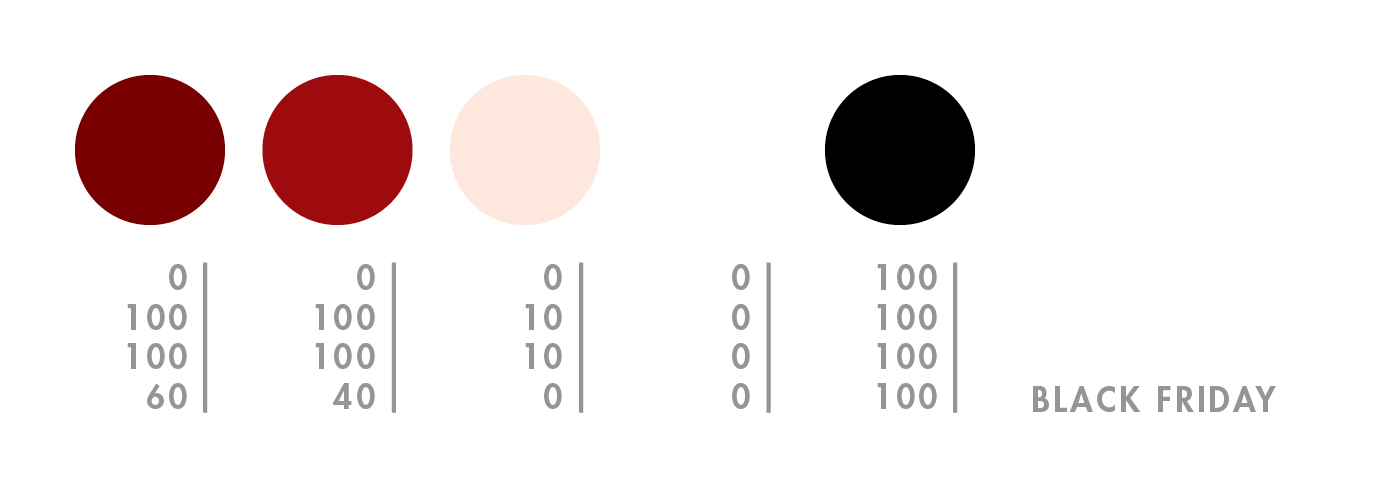
black friday

oh black friday, i’ve easily ignored you in the past, but this year i made an exception…for bras. shopping is one of my least favorite activities, especially if it’s for something i have to wear because i’m incredibly picky with a side of freakish proportions. however, this year i just happen to live within two blocks of macy’s, so i got dressed and left the house around 4:30am. i had some coffee, compliments of macy’s, watched all the cute girls coo in front of the window, and mentally prepared myself for what was to come. finally, they plugged in the last bit of neon and opened the doors. we were greeted by a very authentic rosy-cheeked mr. and mrs. claus as everyone flocked downstairs to make-up and housewares. i escalated to the 5th floor, grabbed a handful of bras that were close to my size, and entered the fitting room. a very small woman yelled at me from outside—YOU LIKE? well…not really. GIVE ME SIZE, I FIND YOU GOOD ONES. she passed a handful back to me…UGLY, BUT COMFORTABLE…YOU TRY! ok, ok. they were very lacy, and quite the opposite of my tastes, but they felt like silky magic on. so i bought three for $50. the end.


macy’s windows | mr. & mrs. claus | bra | bra | bra

Sunday, November 22

alvin diec

i stumbled upon the work of alvin diec way back in august, but i was too busy preparing for my first international trip to write him a proper post. diec is an atlanta-based designer who does what i can only think to describe as beautifully-clean work. his love of food has inspired some wonderful projects, including one flew south and the buccaneer, two of my favorite stationery sets. other notables include his fleet foxes poster and pygmalion theatre promotion, which i yearn to see in detail. finally, if you are in need of design clarity or just want to see what diec is thinking, check out his blog!


the idea is pretty simple. food and drink are probably two of my favorite things. ever. so it happens, i spent a few years doing design primarily for the restaurant industry. it comprises a large part of my portfolio and still represents much of the work i’m most proud of. we’ll just go through a small meal of things i really enjoy, in no particular order: crispy bacon, cloudy wheat beer, plain ol’ white rice, fresh greens, and hot coffee. cheers.

Saturday, October 17

emil kozak

emil kozak is a versatile designer with an an eye for beautiful repetition. kozak’s soaring vectors and clean, yet complex shapes are just the right amount of detail to complement his delightfully unexpected compositions. favorites include elements spring 09, exhibition gallery, and manual. be sure to check out his shop!


obsessed with water…

Tuesday, September 29

gion

exploring gion’s rain-soaked alleys was a magical experience. the machiya architecture with its lovely lanterns, bamboo inu yarai, and ceramic roof tiles all add to to the mysterious beauty of this well-known geisha district. i was lucky enough to catch a glimpse of both geiko and meiko—two in the back of a black car, and i passed another in a narrow alley. i do not have photos of these encounters as i decided to constrain my gaijin instincts and respect their privacy, but i was excited to find that they are even more stunning and graceful in person. hopefully these traditional artists continue to perform in the future. i have a lot of respect for women who brave the rain in a kimono.


mysterious geiko.

Tuesday, September 22

fushimi inari

fushimi inari is one of the first places i think of whenever someone mentions japan. you may recognize the shrine from the movie, memoirs of a geisha. there is a scene where chiyo runs through the toriis after meeting the chairman. i was happy to find it even more stunning in person. endless rows of red-orange toriis winding through the damp, green forest along inari mountain. some of the toriis were seasoned, while others were shiny and new. there were maiko praying for good fortune, bibbed foxes, and the scent of prayer. i’d say the only non-charming thing about the experience were the frequent encounters with large spiders. i wish i could share a photo, but thanks to my arachnophobia i was too freaked out to take one.


halloween shrine.

Friday, September 18

pontocho

pontocho is a narrow alley known for its geisha houses. i didn’t see any geisha, but i did see lots of restaurants and tourists. i found the area visually charming because of the multitude of lanterns and illuminated signs, window decor, and welcoming spaces. the people were also very friendly, despite the many tourists arguing loudly about where to eat. i was glad to have eaten udon at my favorite noodle place before we arrived.


pretty pontocho.

Saturday, September 12

tsukiji

i stayed up all night in nearby ginza just to visit the tsukiji fish market—the largest wholesale fish market in the world. i don’t even like seafood, but i HAD to see the tuna auction that takes place from 5 to 6:15am. it was cold, fascinating, and quite disturbing to see the sellers slide the mammoth frozen carcasses around the floor and then jab them with a metal pick. they were bluish silver with a bright pink circle on the back where the tail fin once was. i was in a state of delirium as i stumbled through the rest of the market on my way out, trying to photograph the multitude of sea creatures, many of which were still moving. as far as recommendations, i’d say go if you love to eat fresh seafood, but otherwise the photos will suffice. i say this because we felt like a huge inconvenience to the hundreds of people working that day, from the vendors setting up their stalls to the men racing around on the miniature trucks. and yes, they WILL run you over.


bloodbath on ice.

Friday, September 11

asakusa

my favorite part of tokyo so far is probably asakusa, pronounced uh-sock-sa. why? because i was in kokeshi heaven. everywhere i went, kawaii kokeshi! and there were other things such as wagashi, umbrellas, and washi. if you’re not into shopping, you can relax at the sensō-ji temple, with this man, or go check out the five-story pagoda next door.


is there a kokeshi temple?

Saturday, September 5

shinjuku

i received my first dose of sensory overload in the bright and ever-
blinking shinjuku, one of tokyo’s 23 special wards. the fun began at the train station—the busiest in the world—and ended hours later as i drug my drooling husband away from the never-ending rows of pachinko, just one of thousands of games to choose from. it was fun with a bit of dizzy, cute with some scary, and an overall magical first look at the great city of tokyo!


neon night.

Wednesday, September 2

asaborake

konnichiwa from japan! it’s taken me quite a while to complete this post as i have been enchanted and distracted by this lovely island nation, but here goes—enjoy!

asaborake is run by two sisters—junko dono, who lives in japan and mari, who lives in orange county. junko dono designs and hand-makes these gorgeous bags out of kimonos and leather, while mari handles all of the important miscellaneous details that arise with a new company. some of my favorite pieces include the pen case, expression bag, and small tote bag. for new items and other interesting commentary, check out asaborake’s blog.


from junko dono:
1—i believe i look the best in this color?! it is a cool color, but also gives me warmth. 2—good to blend this color into my skin color. 3—color of denim / aizome (japanese traditional indigo-dyeing). my basic color. 4—color of the sun. i like to put this color on denim. 5—the color of forest.

from mari:
by the way, i saw your plan to travel to japan. it sounds really exciting! japan is full of colors!!! i like the colors being used in old shrines and temples, and the color of the surrounding nature. i hope you can find very special colors in japan! have a nice trip!