Showing posts with label yellow. Show all posts

Friday, December 31

barnaby ward

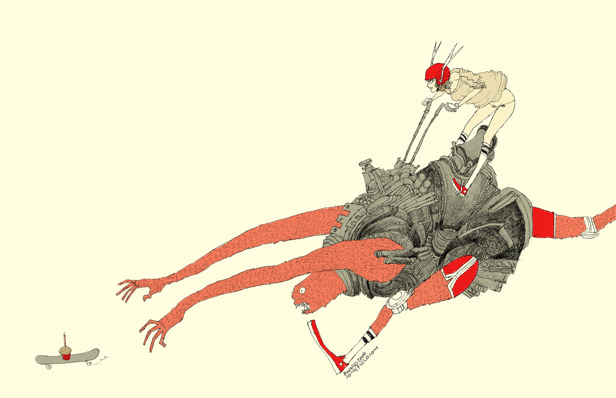
wave goodbye to 2010 with barnaby ward from barbados! he is the talented illustrator behind somefield, a magical place filled with liney ladies cradling insects. i am in love with his minimal backgrounds and exciting flashes of color. there are far too many wonderful pieces to list all of my favorites, but here are the top three: 1 | 2 | 3. you can purchase prints here or here, and for a little desktop joy, click here.


1—midnight misregistration
2—the sad eggplant
3—someone put lipstick on the cat’s butt again
4—suffocating silt cloud
5—bronchitis is gross

Sunday, October 17

burning man

hello mid-october. it feels like i just returned from burning man, but NO—it was over a month ago! what a slacker i am. to explain burning man to someone who has never been is painful and damn near impossible (for me, at least). so here’s a quick visual re-cap of this year’s burn:


day 1—waited in the longest (and most exhilarating) line of my life.

day 2—move in + rain! + rare supernumerary double rainbow.

day 3—campmate sleeps + first view of the temple + silly self portrait + campmate porta anxiety + party time + bliss dance + deutsch hilarity + happy glow.

day 4—biking with campmate + frolicking in my bloomers (thanks mom) + up all night + dodge a dragon + bubble sunrise + sigh

day 5—alien sighting at center camp + sensory overload + meet martin + temple snuggling + middle of nowhere + surprise! 4am grilled cheese under the stars + stumbling home in the dark.

day 6—raining skydivers + one last ride out to the man + waved goodbye to the lamplighters.

for a wonderful literary description of burning man, here’s the best i’ve read by robin esrock.

Monday, August 2

scott london

scott london is a talented journalist, author, and photographer who has been capturing the magic that is burning man since 2004. black rock city is such a vast, intricate, and indescribably beautiful experience—i am always elated when i stumble upon photographers who have managed to record that beauty forever. here are a few of my favorite moments—blue couple, white stilts, playa nap, and lady in pink. you can read more about scott and his many fascinating adventures here.


1—burning man is set against a backdrop of desert, mountains and sky. its defining feature is the playa—a vast empty canvas for creative self-expression. i love it when the wind kicks up and the entire place is hurled through with dust.

2—watching the sun rise over the black rock mountains is one of life’s most exquisite rewards. the first rays of light are a golden yellow and always inspire a kind of hushed reverie.

3—the skies are never as blue as they are in the black rock desert. in the morning, shortly after sunrise, or in the late afternoon before dusk, i like to drag people out on the playa and make portraits against the soft blue sky.

4—as most burners will tell you, the event only fully comes alive at night when the playa is transformed into a carnival of flashing neon signs, wacky art cars, pyrotechnic displays and pulsing soundscapes. even on a moonless night, the sky is dark blue, alight with stars.

5—the beauty of fire is that it contains within it a remarkable spectrum of colors, from purples and reds to oranges and yellows. when the man goes up in flames toward the end of the event, the heat from the fire is so intense you can feel it a half-mile away and so bright you need sunglasses. a dazzling spectacle.

Tuesday, July 27

elodie rambaud

everything elodie rambaud touches turns to pretty. in addition to her eye for color and detail, this french stylist has such a charming sense of composition, and much of her work features FOOD—even better! you may want to grab a snack—favorite elodie stylings include pea chervil, blueberries, and meringue. if you’re a fan of interiors, don’t miss her interior styling portfolio.


p.s. who knew that particular yellow would look SO good next to that pink?

Sunday, July 11

cynthia ona innis

what i find most compelling about the work of cynthia ona innis is the way she captures the flourishing minutia of life. i have been admiring her work for some time, but last month i was able to view it in person at the sf fine art fair— the online photos simply do not do her justice. my favorite pieces include tug, fugitive, and power plant. if you’ll be in los angeles this november, be sure to attend her show at the walter maciel gallery!


i worked with summertime childhood memories to come up with these colors. growing up near the beach & bay in san diego, the colors of the water kept coming to mind. then there are a few other colors: my mom’s (paint-peeling) car in the 70s/80s and this bubblegum ice cream they made by hand at ocean beach.

Sunday, June 27

san francisco pride

i scored a sweet spot on market street at third. it was oddly warm and completely fog-free. i fiddled with my camera in an attempt to distract myself from the annoyingly oblivious, yet cute italian tourists that kept stepping on my blanket and kneeing me in the back. initially things were very exciting—dykes on bikes, fancy ladies, and a vegan pig, but the sf pride parade is incredibly LONG, and i only lasted one hour before i had to make a pit stop at the palace. naturally i lost my spot so i herded underground to hop on muni toward the civic center; however, i was not prepared for that amount of choas DURING the parade, so i reversed course and started walking, or rather skillfully darting to protect my camera from the sloshing fountains of beer. i made it to the civic center in about 30 minutes, at which point i decided i couldn’t possibly carry around my bag ALL afternoon. i walked home, relaxed for a bit, and then walked back. i have no idea what time that was, but the parade was still blasting! this time i was unable to cope with the madness so i started drinking (thank you for the free shots!), which was an excellent decision as i ended up with some garlic fries, annihilating a chicken kabob (completely uncharacteristic of me), and doing a trance dance (also atypical) with a group of local femmes. i staggered home for the second time and collapsed on my futon, which is when i discovered that i'd only taken 25 mediocre photos—FAIL! aw, well…40 & fabulous! i hope i’m that much fun when i turn 40.

Monday, February 15

katie kirk

illustrator, katie kirk is a master of the bézier curve. she successfully simplifies complex ideas and turns them into light-hearted vector fun. my favorites include queen pattern, head, and birds. also, be sure to check out her soon-to-be-published book, eli, no!


i chose the colors from this. not really sure why—they just seemed fun ;)

Monday, February 1

neely jacobson

i recently reconnected with neely jacobson, one of the kindest and funniest people i remember from high school. these days she is one talented photographer. all of her photos are gorgeous, but i keep returning to the portraits. her wonderful personality must put people at ease because she is able to capture the sincerest expressions. my faves include jillian + james, kendi, maple rings, jeramie jump, and most of all, this one of her little girl, drew.


they just look like colors that would taste good. they make sense to me. i LOVE the mustardy-olivey green colors. i never get tired of that color. and the coral pink reminds me of my daughter drew for some reason. the turquoise reminds me of california (my favorite place away from home) and the grayish color looks real, innocent, soft, old, classic, calming, and homey to me.

Monday, January 25

elsa mora

wow, where do i begin? elsa mora, aka elsita, is a cuban-born artist whose talent exceeds classification. i knew of her first as a paper artist, responsible for perfectly-curved edges and the conceptually-brilliant paper sculpture, fears, and el corazon. more recently, i’ve been following her—GASP personal style, which has left me equally enchanted and a tad underdressed. her creations span all media—here, a few of my favorite gems: el jardin de maria julia, missing garden, mimi, unlimited flower protection, felted necklace, emanuel, her way, uchi…i really could go on forever. OH, and did i mention her new book?! for updates on all things elsita or to purchase her lovely creations, stop by her main blog.


here i did a selection of colors that i love. but the truth is that i love all the colors in the rainbow. to me each color is a door to a new world, each one of them has a personality, a language and i’m always curious to see what they “have to say”.

Tuesday, January 5

romain philippon

i find romain philippon’s inconscience incredibly captivating. i love examining the photos for trinkets and other clues to personality and profession, while the owners lie sleeping. i enjoy seeing people through romain’s eyes—everyone is so real, yet hopeful. other favorites include a0003b, a0018, and a0007. romain lives in réunion, an island amidst the indian ocean. for inspiration, check out his blog.


to me these colors mean asia, africa, europe, south america, and reunion island (where i live).

Monday, January 4

monina velarde

monina velarde is a chicago-based graphic designer who recently won
the aiga command x competition—congratulations! i am a fan of her lift airlines identity, this superfun new year’s resolution generator, and cleanse packaging, which you can view on her site. you can follow monina’s work…and possibly score some tasty-looking baked goods
on her blog!


one of my favorite projects that i’ve gotten to work on was designing the identity for the kansas city art institute school of design. i worked on it
with my good friend, jessica bayer. we took the basic elements of swiss design, the fundamentals of what the kcai design program was founded on, and reinterpreted them to fit within today
s design culture. we derived our color palette from swiss poster design. the colors used were primary green, yellow, red, blue and black. these colors were then updated by us to fit contemporary design.

Sunday, January 3

tiffany shih

tiffany shih designed the most fantastic bra packaging i've ever seen. what i wouldn’t give to be an apple. i am also fond of her how to be a texan poster, which you can use to make your own hat—yeehaw! i can’t wait to see what this girl comes up with post-graduation.


my work tends to be obnoxiously bright, bold and loud. i think it’s very reflective of my personality—not to say that i annoy everyone that i come across (although friends and family might say otherwise), but i’m not afraid to be goofy and sing loudly on the streets if i feel the sudden urge to. i’ve also been told by the roommates that they can hear me laughing in my room through the window from a couple of streets away.

…yeah…i’m one of those people.

Monday, December 14

mike rivamonte

i am very excited to bring you robot sculptor, mike rivamonte. he is an avid science fan who grew up making anything he could get his hands on. his curious mind comes up with some of the most endearing robots i’ve seen. i want to be friends with edison, walt, and ace—complete with led jet pack! be sure to check out mike’s prints too.


my work is greatly influenced by my family. as kids my mom would take us to countless antique stores, curio shops and flea markets. during these ‘field trips’ i marveled over dusty scientific instruments, phonographs and other obscure mechanical devices. i developed a deep appreciation and interest of inventions and history. i picked up the love of making things from my father and uncles. my dad built our first color television set, all kinds of radios and our first computer. he could and would build anything. we constructed many things together. my uncles, one a science teacher the other a carpenter, fueled my inquisitive, experimental nature and appreciation for the finer points of craftsmanship.

Thursday, November 26

happy t-day

this is our 5th thanksgiving alone since we moved to san francisco, and we’ve turned it into our very own yellow day of joy. we spend wednesday evening and thursday morning baking (in our underwear) the tastiest, most midwestern plate of carbs you’ll ever see.* for a laugh, check out my husband’s thanksgiving shopping list.


my plate: homemade noodles | stuffing | mac + cheese | corn | potatoes
*no, that roll isn’t giant…the plate is tiny.

Sunday, November 22

alvin diec

i stumbled upon the work of alvin diec way back in august, but i was too busy preparing for my first international trip to write him a proper post. diec is an atlanta-based designer who does what i can only think to describe as beautifully-clean work. his love of food has inspired some wonderful projects, including one flew south and the buccaneer, two of my favorite stationery sets. other notables include his fleet foxes poster and pygmalion theatre promotion, which i yearn to see in detail. finally, if you are in need of design clarity or just want to see what diec is thinking, check out his blog!


the idea is pretty simple. food and drink are probably two of my favorite things. ever. so it happens, i spent a few years doing design primarily for the restaurant industry. it comprises a large part of my portfolio and still represents much of the work i’m most proud of. we’ll just go through a small meal of things i really enjoy, in no particular order: crispy bacon, cloudy wheat beer, plain ol’ white rice, fresh greens, and hot coffee. cheers.

Friday, October 16

frank chimero

today i bring you frank chimero, a super-talented illustrator, designer, and writer. frank is full of ideas, and he is pro at concise communication. i love his life and design poster, state illustrations, and monster tee most of all. AND in addition to his extremely entertaining blog, he also co-writes questionable characters with ben barry. go get some answers!


so i’m sitting at a table with a full setting for myself and a few good friends. i’m on a trip in the san juan islands, a couple of small blobs of land poking out of the puget sound thanks to some geographic anomaly. there’s a huge set of windows to my right. if i look out, i have a view of all the other tree-speckled islands, which fade off in a blue atmospheric haze. it’s clear today, and it feels like i can stare out forever. also, this napkin is yellow and orange and purple.

Sunday, September 20

64 colors

64 colors is an extremely talented pair of creatives named laura and eric. you may know them if you are active in the toy scene. their little marshall has traveled all over—here he is in tokyo! in addition to toys, 64 colors also designs prints and paints wonderful worlds that feature their characters. some of my favorite prints are miso tippy and noodles, which i appreciate even more now that they are a daily part of my diet in japan. the paintings i cant get enough of are control freak, sweet dreams, toast, and destination unknown. if you love 64 colors and need a place to sketch, you should check out their new artist chubby book, which is now available on pinkghost!

and, as you can imagine, with a name like 64 colors it was
torture choosing just 5, so they would like to add a lovely black—
60 | 70 | 70 | 70—to the palette below.


our version of a soft palette, picked from 50/60s books and prints. we really need 6 colors to complete our set. break the rules!

Friday, September 18

pontocho

pontocho is a narrow alley known for its geisha houses. i didn’t see any geisha, but i did see lots of restaurants and tourists. i found the area visually charming because of the multitude of lanterns and illuminated signs, window decor, and welcoming spaces. the people were also very friendly, despite the many tourists arguing loudly about where to eat. i was glad to have eaten udon at my favorite noodle place before we arrived.


pretty pontocho.

Thursday, September 17

nijo castle

nijo castle is surrounded by the most gorgeous greens ive ever seen. the foliage, the moat, the aging metals, are all lovely shades of midori (green). the best part for izaak was the ninomaru palace—an audio technicians dream with its singing nightingale floors.


natures song.

Wednesday, September 16

kamakura

we took a day trip to kamakura to see yabusame, or japanese archery. there is a festival at the hachiman-gu shrine twice a year. it is apparently very popular because all we ended up seeing where the shinto people praying and the grounds as we ran through the forest looking for a better view. i finally lucked out and was roped off by a police officer where i got close enough to capture the archers making their way to their horses—the costumes were elaborate and worth the wait.


yabusame wardrobe.