Monday, June 29

elisa sassi

elisa sassi just moved from london to san francisco—welcome elisa! i especially love the way she pairs her whimsical illustrations with white backgrounds and unpredictable color combinations. elisa has created everything from ads and posters to exciting wall adventures. some of my favorite pieces include this amazing baby room, inspiring rainforest ad, and supercute san francisco print. i hope to see elisas original artwork in one of my favorite sf galleries very soon.


it’s one of my favorites palettes, maybe ’cause with it i can paint myself under a tree in a field of orange tulips under a blue sky wearing a white dress. =D

Friday, June 26

andrew bell

the head of andrew bell is filled with all kinds of things that may shock, scare, disturb, or just make you giggle. on occasion, i experience all
those feelings at once and i love it! my favorite creatures include for the dog, comb over, imaeachoo, picker, metitis, and tony danza…hee hee. you can also find all kinds of fun things, including toys and books, in andrew’s shop.


while i have recently been experimenting with bright colors, muted colors and everything in between, these few shades of grey, black and red will always be the bare minimum that i require to express myself. they may seem boring, but to me they are colors of infinite possibility. you’ll see them represented in thousands of creature drawings from the last 7 years, as well as in my own company branding and name. what is black, white and red all over?…a dead zebra.

Thursday, June 25

mayuko fujino

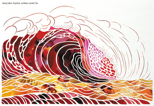
mayuko fujino creates some of the most gorgeous paper collages i’ve ever seen. i love the composition, shapes, color, subject—everything. my favorite piece is heavenly bodies #17, but other notables include heavenly bodies #5, black hummingbird, red wave, and this recent piece from mayuko’s upcoming solo show—the day of the sea (海の日 / umi no hi). the show opens in tokyo on july 20th. i hope to see some of mayuko’s work when i visit japan this september!


currently i’ve been working on new pieces for my solo show in july, and i use colors like these very often lately. i’m in the mood for these.

Tuesday, June 23

linda olafsdottir

linda olafsdottir is a fellow academy alumna, originally from reykjavík, iceland. she recently finished her mfa thesis, which includes several spectacular children’s book illustrations. my favorite is airplane, where the little girl in her story flies for the first time. i also love the mood and color palette of homesick and the stunning perspective of big city. you can stay posted on linda’s stories and illustrations on her blog.


p.s. good luck with your book linda…let me know when it’s published!

Monday, June 22

june leeloo

flowers were the first love of artist, june leeloo. she dreamt of traveling the world as a botanist, yet happily ended up a painter. my absolute favorite leeloo piece is hatsuharu. i’m also fond of the peaceful sayoko, which you can see in person at the black maria gallery in los angeles through july 11th along with two other lovely leeloo pieces.


they are the colours i use the most, my very favourite ones.

Friday, June 19

áron jancsó

hungarian type-extraordinaire, áron jancsó loves to create type from scratch. he dreams it, draws it, measures it, painstakingly refines it and then presents it to the world. some of my favorite jancsó pieces include a type portrait, his experimental name piece, the wonderful opportunity poster, and a french film festival poster. i’m hoping his type will be available for purchase soon!

Sunday, June 14

7th wedding anniversary

my husband, izaak, and i spent our 7th anniversary in japantown this year. we aren’t really romantic in the traditional sense of the word, but there is never a dull moment with izaak. in september we are taking our first international trip to japan so this was a fun preview.


these colors were inspired by our day of japanese pop culture and sake, courtesy of hotel tomo.

Saturday, June 13

chris anthony

i am a big fan of photography, but rarely does it make me gasp the way a painting does. i had one of those moments when i saw chris anthony’s victims & avengers series. the concept, composition, light, and color—all stunning! specific favorites include emily #3, zooey #2, and max. be sure to check out the rest of his work if you aren’t familiar with it—the new venice* series, which opened at the corey helford gallery last march, is both shocking and serene.


*venice is a metaphor for a sinking city, deserving of nature’s wrath, leaving its citizens to tread water and explore new ways to sustain life
on aquatic earth.

Wednesday, June 10

igor dukic

igor dukic creates vector illustrations that feel original and impulsive. i am especially fond of these flowers, bleeding for help, and this silly holiday monkey. dukic also has an extensive icons portfolio—favs include bgreen, mosaic, and these loving pets.


dukics color palette was inspired by this recent illustration.

igor, better know as pez because of his long neck and large adams apple, comes from hills of central bosnia. let me lift my head and offer you a candy. i found myself through my art, i hope i can help you find you!

Tuesday, June 9

josh kenyon

josh kenyon has found the perfect balance of design and illustration.
i absolutely love this wedding invitationthis one too! his diverse
portfolio is filled with all kinds of fun, including guitars and this
coveted bathroom.


i have pretty much only been designing in these colors for the past couple months. i am currently working on a zine/show with colby nichols under our collaboration name JOLBY. i know its a wacky palette but it was something that made me smile. i think thats how i always pick colors.

Monday, June 8

bogdan chesaru

romanian photographer, bogdan chesaru captures images that are both exhilarating and serene. they transfix me for hours while i make up stories about them, but the most fascinating story is that of their creation. chesaru macro-photographs soap bubbles that have been captured in a wire frame, and he has titled this collection a kind of magic: the ephemeral universe of a soap bubble. two of my favorites are migration and substantia rubra—you can order your favorites here.


photographing light interference on soap bubbles is a very challenging process. my role as an artist is to isolate the most pleasant combination of colors from the vibrant chaos that form on the soap film. choosing just five solid colors from the rich gradients that i record in my images was quite a challenge. these were taken from awakening—one of my favorite soap bubble photographs.

Sunday, June 7

andy mangold

this bike-loving designer has a talent for making things fun—from his web language to his reinvented rubber band gun, the rubber banditandy mangold makes life more interesting. other favs by andy include this brain shopping poster, the hilarious otter pop tower, and his impressive book arts collection.


nothing is better than a nice, warm and toasty, burnt orange. i also enjoy ridiculously bright colors that hurt peoples brains and neutrals that are JUST A LITTLE BIT off of straight gray.

Monday, June 1

lawrence yang

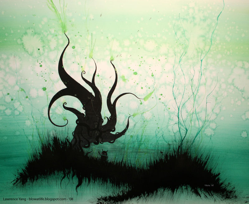
i am currently fascinated by san francisco artist, lawrence yang. i love watching his ink, marker, and watercolor paintings come alive—you can view his work daily on his blog! i am loving mario apocalypse, sideshow, and tree droid. i cant wait to see his paintings in person at gallery 1988 next month.


it was hard to pick just five colors!

Sunday, May 31

felix jackson, jr.

felix jackson, jr. is the illustrator responsible for this awesome leaving records print, currently popping up all over the internet. sadly this print is no longer available, but there are plenty of other great things by felix to see. his sweaters is another one of my favorites along with this cheerful yes, please obama piece. watch for your favorites in his store.


funky stuff.

Saturday, May 30

jublin

i was wandering through flickr, as i often do, when i discovered the work of jublin, alias of the talented illustrator, justin white. it was his busted up pokemon series that caught my eye. he chose to capture them post-battle in all their mutilated vector glory. i also really enjoyed his random vector work series on behance…funny stuff happening in there!


about the colors…i tend to use a lot of pink. subconsciously, im constantly worrying that pink isnt manly enough, so to compensate i make sure the subject matter isnt too happy-go-lucky. i enjoy the contrast of cute and cuddly with a little bit of sick and twisted. and im not really sure why, but there are times that i just really love bright saturated colors that make my eyes bleed.

Thursday, May 28

kate wilson

london-based illustrator, kate wilson, does the most delicately-beautiful drawings using mostly ink with the occasional splash of watercolor. i cant stop admiring this sweet bird…and this one cracks me up every time. non-avian favorites include these herbs and this thoughtful bear.


kates colors were inspired by this little flapper.

i tend to use pale peachy colours in the background because of the vintage paper i use, but layered over these i love little touches of bright vibrant colours to emphasize different parts of the birds.

Wednesday, May 27

anthony hurd

anthony hurd must be a magical man—his titles include artist, director, illustrator, designer, and animator. i am a big fan of his face of the earth paintings, in which he took blocks of wood and brought out the monster within. another fav is his pink metrosexual monster, which is available as a print! and lastly, for some musical motion fun, check out his reel.


in general my favorite color is magenta…just such a vibrant color that evokes such strong reactions—some hate it, some love it.

Monday, May 25

memorial day

i took a little break from posting yesterday so that i could fully enjoy the holiday weekend. i don’t personally know any u.s. men and women who have died in service, but i appreciate their dedication all the same.


these are common colors that popped up when i googled memorial day.

Saturday, May 23

rachel wong

rachel wong is a los angeles-based visual development artist with a great sense of humor—see angry sheep for a laugh. her character and environment designs are spectacular and her fabulous color choices are the icing on the cake. some of my favorite digital pieces include her charming trees and eccentric houses. rachel also does gallery work on occasion, and this monster painting just became one of my all-time faves.


i love to make bold statements with contrasting color and push the boundaries of color reality. for my paintings, i’ll usually have an overall emphasis on cool colors and accent with a warm focal point or vice versa. nothing subtle here.

Friday, May 22

vincent altamore

vincent altamores ability to capture likeness is remarkable, and i absolutely love his caricature style. i first saw his work in the 2008 commarts illustration annual—he did a portrait of johnny depp. some of my favorite sketches include those of hugh laurie, steve buscemi, frida kahlo, and tim burton.


1—because it reminded me of my dogs fur...and that makes me happy. 2—the color of a nice glass of cabernet…now all i need is a piece of aged provolone and some warm bread. 3—i just thought it was a perfect blue…the color you want your sky to be after a really bad storm. 4—total black, just so quiet…like standing on the bow of ship in the middle of the ocean at night. 5—the color of fresh, clean linen thats been dried on an outdoor clothesline.