i am very excited to bring you robot sculptor, mike rivamonte. he is an avid science fan who grew up making anything he could get his hands on. his curious mind comes up with some of the most endearing robots i’ve seen. i want to be friends with edison, walt, and ace—complete with led jet pack! be sure to check out mike’s prints too.
my work is greatly influenced by my family. as kids my mom would take us to countless antique stores, curio shops and flea markets. during these ‘field trips’ i marveled over dusty scientific instruments, phonographs and other obscure mechanical devices. i developed a deep appreciation and interest of inventions and history. i picked up the love of making things from my father and uncles. my dad built our first color television set, all kinds of radios and our first computer. he could and would build anything. we constructed many things together. my uncles, one a science teacher the other a carpenter, fueled my inquisitive, experimental nature and appreciation for the finer points of craftsmanship.
Monday, December 14
Sunday, December 6
cate anevski
cate anevski is a creative extraordinaire that i found on flickr…back in march! for some reason we keep losing each other in the interwebs. i email her, she emails me, i never get it, i email again, she emails me, i bury the email in my box—no more of this—it is time! what i love most about cate’s work is her charming outlook on the world. her unique style is present in every medium she uses. my favorite illustration work includes celtic knot, marie antoinette, and elemental nymphs, which are now available in cate’s etsy shop! i’m also a fan of her eleven-eyed monster and leet embroidery skills. for recent work, updates, and all things worth doing in portland, stop by her blog.
i have recently undergone my first portland, oregon, winter, and the gray weather left me a bit starved for the warm colors of the sun. my latest illustrations reflect this with a bright pink and orange palette.
Labels:
illustration,
orange,
pink,
red,
textiles
Friday, November 27
black friday
oh black friday, i’ve easily ignored you in the past, but this year i made an exception…for bras. shopping is one of my least favorite activities, especially if it’s for something i have to wear because i’m incredibly picky with a side of freakish proportions. however, this year i just happen to live within two blocks of macy’s, so i got dressed and left the house around 4:30am. i had some coffee, compliments of macy’s, watched all the cute girls coo in front of the window, and mentally prepared myself for what was to come. finally, they plugged in the last bit of neon and opened the doors. we were greeted by a very authentic rosy-cheeked mr. and mrs. claus as everyone flocked downstairs to make-up and housewares. i escalated to the 5th floor, grabbed a handful of bras that were close to my size, and entered the fitting room. a very small woman yelled at me from outside—YOU LIKE? well…not really. GIVE ME SIZE, I FIND YOU GOOD ONES. she passed a handful back to me…UGLY, BUT COMFORTABLE…YOU TRY! ok, ok. they were very lacy, and quite the opposite of my tastes, but they felt like silky magic on. so i bought three for $50. the end.
macy’s windows | mr. & mrs. claus | bra | bra | bra
Thursday, November 26
happy t-day
this is our 5th thanksgiving alone since we moved to san francisco, and we’ve turned it into our very own yellow day of joy. we spend wednesday evening and thursday morning baking (in our underwear) the tastiest, most midwestern plate of carbs you’ll ever see.* for a laugh, check out my husband’s thanksgiving shopping list.
my plate: homemade noodles | stuffing | mac + cheese | corn | potatoes
*no, that roll isn’t giant…the plate is tiny.
my plate: homemade noodles | stuffing | mac + cheese | corn | potatoes
*no, that roll isn’t giant…the plate is tiny.
Sunday, November 22
alvin diec
i stumbled upon the work of alvin diec way back in august, but i was too busy preparing for my first international trip to write him a proper post. diec is an atlanta-based designer who does what i can only think to describe as beautifully-clean work. his love of food has inspired some wonderful projects, including one flew south and the buccaneer, two of my favorite stationery sets. other notables include his fleet foxes poster and pygmalion theatre promotion, which i yearn to see in detail. finally, if you are in need of design clarity or just want to see what diec is thinking, check out his blog!
the idea is pretty simple. food and drink are probably two of my favorite things. ever. so it happens, i spent a few years doing design primarily for the restaurant industry. it comprises a large part of my portfolio and still represents much of the work i’m most proud of. we’ll just go through a small meal of things i really enjoy, in no particular order: crispy bacon, cloudy wheat beer, plain ol’ white rice, fresh greens, and hot coffee. cheers.
Monday, October 19
michelle ‘milo’ white
michelle ‘milo’ white is a line-lovin’ lady who uses graphite and acrylics to create unique, angular characters. my favorite part about her work is the way she renders faces, carving them out piece by piece like a wooden sculpture. i am fond of tree, nymph, memories, shin bone, and twin. be sure to check milo’s blog for new work.
i’m a san francisco illustrator who’s crazy about line work. i use color in a supporting role…very little…just a pop of pink to breathe some life into a piece. i love architect’s handwriting, blueprints and wood grain. my colors may appear subtle but they are accompanied by a heavy hand of black ink. the juxtaposition of the two brings me balance.
Labels:
art,
blue,
gray,
illustration,
pink
Sunday, October 18
jennifer davis
i was ecstatic when i stumbled upon the work of artist, jennifer davis. her colors are so unique. she uses soft linework and surrounds her charming cast of characters with magical environments filled with balloons and bits of nature. because she works with such a serene palette, her paintings feel even more special when she adds a bright color. the paintings i enjoy most are sea lions, sent, refrain, remember, catharsis and listen. visit her blog for new paintings and show info.
Saturday, October 17
emil kozak
emil kozak is a versatile designer with an an eye for beautiful repetition. kozak’s soaring vectors and clean, yet complex shapes are just the right amount of detail to complement his delightfully unexpected compositions. favorites include elements spring 09, exhibition gallery, and manual. be sure to check out his shop!
obsessed with water…
Labels:
blue,
design,
gray,
illustration,
red
Friday, October 16
frank chimero
today i bring you frank chimero, a super-talented illustrator, designer, and writer. frank is full of ideas, and he is pro at concise communication. i love his life and design poster, state illustrations, and monster tee most of all. AND in addition to his extremely entertaining blog, he also co-writes questionable characters with ben barry. go get some answers!
so i’m sitting at a table with a full setting for myself and a few good friends. i’m on a trip in the san juan islands, a couple of small blobs of land poking out of the puget sound thanks to some geographic anomaly. there’s a huge set of windows to my right. if i look out, i have a view of all the other tree-speckled islands, which fade off in a blue atmospheric haze. it’s clear today, and it feels like i can stare out forever. also, this napkin is yellow and orange and purple.
Labels:
blue,
design,
green,
illustration,
literature,
orange,
purple,
yellow
Thursday, October 1
nara
we contemplated skipping the day trip to nara all together. we grew up around deer so it didn’t seem worth the bumpy train ride through the mountains—my husband gets pretty severe kinetosis. we were thrilled to be wrong. it may have been the most enjoyable thing we did together. in retrospect it makes sense, we both get more excited about animals than people. and when they look like this, how could you not love them? the secret to enjoying the deer in nara is this—either buy shika sembei (deer biscuits) and quickly feed the deer or do not purchase biscuits at all. running around trying to photograph the deer while taunting them with biscuits proved traumatic for many visitors that day. the deer have learned that head-butting the men in the groin make the biscuits magically fall from the sky. since women often squeal and run, the deer chase them in a herd until the biscuits are surrendered. they do seem to leave the children alone for the most part, only reaching high into the air to snatch the biscuits from the smallest ones. and the cutest thing happens while they await their treat—they bow! some say they have learned to imitate the japanese, others (my husband) says they are simply preparing to buck you in the crotch. either way, it is done with the tongue slightly out and is the cutest thing i’ve ever seen.
bambi bow.
bambi bow.
Tuesday, September 29
gion
exploring gion’s rain-soaked alleys was a magical experience. the machiya architecture with its lovely lanterns, bamboo inu yarai, and ceramic roof tiles all add to to the mysterious beauty of this well-known geisha district. i was lucky enough to catch a glimpse of both geiko and meiko—two in the back of a black car, and i passed another in a narrow alley. i do not have photos of these encounters as i decided to constrain my gaijin instincts and respect their privacy, but i was excited to find that they are even more stunning and graceful in person. hopefully these traditional artists continue to perform in the future. i have a lot of respect for women who brave the rain in a kimono.
mysterious geiko.
mysterious geiko.
Saturday, September 26
himeji castle
we took a day trip to himeji to see himeji castle, also known as the white heron. it’s the most impressive castle i’ve seen, complete with moat, stoney fortress, super steep stairs, and secret doors. and if that weren’t enough to remember, my first cup of matcha was served at the koko-en garden tea house. it was hot, frothy, and my favorite hue of green. i even learned how to make it using a bamboo chasen! and although my sugar handicap prevented me from sampling the wagashi, i was able to capture the handmade confection forever. banzai!
matcha castle.
matcha castle.
Wednesday, September 23
arashiyama
arishiyama is an area in northwest kyoto. we went for two things—the sagano bamboo forest and tenryu-ji temple. walking through the bamboo was quiet and surreal. the forest was cool and wet—we were completely drenched by the time we reached the temple. tenryu-ji offered a rest on tatami mats, beautiful color-changing flowers, meticulously-maintained gardens and additional views of the bamboo.
bamboozled.
bamboozled.
Tuesday, September 22
fushimi inari
fushimi inari is one of the first places i think of whenever someone mentions japan. you may recognize the shrine from the movie, memoirs of a geisha. there is a scene where chiyo runs through the toriis after meeting the chairman. i was happy to find it even more stunning in person. endless rows of red-orange toriis winding through the damp, green forest along inari mountain. some of the toriis were seasoned, while others were shiny and new. there were maiko praying for good fortune, bibbed foxes, and the scent of prayer. i’d say the only non-charming thing about the experience were the frequent encounters with large spiders. i wish i could share a photo, but thanks to my arachnophobia i was too freaked out to take one.
halloween shrine.
halloween shrine.
Sunday, September 20
64 colors
64 colors is an extremely talented pair of creatives named laura and eric. you may know them if you are active in the toy scene. their little marshall has traveled all over—here he is in tokyo! in addition to toys, 64 colors also designs prints and paints wonderful worlds that feature their characters. some of my favorite prints are miso tippy and noodles, which i appreciate even more now that they are a daily part of my diet in japan. the paintings i can’t get enough of are control freak, sweet dreams, toast, and destination unknown. if you love 64 colors and need a place to sketch, you should check out their new artist chubby book, which is now available on pinkghost!
and, as you can imagine, with a name like 64 colors it was
torture choosing just 5, so they would like to add a lovely black—
60 | 70 | 70 | 70—to the palette below.
our version of a soft palette, picked from 50/60s books and prints. we really need 6 colors to complete our set. break the rules!
and, as you can imagine, with a name like 64 colors it was
torture choosing just 5, so they would like to add a lovely black—
60 | 70 | 70 | 70—to the palette below.
our version of a soft palette, picked from 50/60s books and prints. we really need 6 colors to complete our set. break the rules!
Friday, September 18
pontocho
pontocho is a narrow alley known for its geisha houses. i didn’t see any geisha, but i did see lots of restaurants and tourists. i found the area visually charming because of the multitude of lanterns and illuminated signs, window decor, and welcoming spaces. the people were also very friendly, despite the many tourists arguing loudly about where to eat. i was glad to have eaten udon at my favorite noodle place before we arrived.
pretty pontocho.
pretty pontocho.
Thursday, September 17
nijo castle
nijo castle is surrounded by the most gorgeous greens i’ve ever seen. the foliage, the moat, the aging metals, are all lovely shades of midori (green). the best part for izaak was the ninomaru palace—an audio technician’s dream with its singing nightingale floors.
nature’s song.
nature’s song.
Wednesday, September 16
kamakura
we took a day trip to kamakura to see yabusame, or japanese archery. there is a festival at the hachiman-gu shrine twice a year. it is apparently very popular because all we ended up seeing where the shinto people praying and the grounds as we ran through the forest looking for a better view. i finally lucked out and was roped off by a police officer where i got close enough to capture the archers making their way to their horses—the costumes were elaborate and worth the wait.
yabusame wardrobe.
yabusame wardrobe.
Tuesday, September 15
yokohama
we ended up spending two days in yokohama because there were so many fun things to do. we went through chinatown—the largest in japan—where we were surrounded by all sorts of panda souvenirs. the atmosphere was enchanting—lanterns overhead, narrow streets, ornate facades, until my husband was yelled at (his first time here…not mine) for opening what he thought was a trash can. we’re not sure what its actual purpose was or if we just misunderstood the woman yelling, but we decided it was a good time say sayonara. we ended up at cosmoworld around dark, for a spectacular view of the famed ferris wheel, and we were able to get a panoramic view of yokohama at night from the landmark tower. it was the best view i’ve seen to date.
a view for lovers.
a view for lovers.
Saturday, September 12
tsukiji
i stayed up all night in nearby ginza just to visit the tsukiji fish market—the largest wholesale fish market in the world. i don’t even like seafood, but i HAD to see the tuna auction that takes place from 5 to 6:15am. it was cold, fascinating, and quite disturbing to see the sellers slide the mammoth frozen carcasses around the floor and then jab them with a metal pick. they were bluish silver with a bright pink circle on the back where the tail fin once was. i was in a state of delirium as i stumbled through the rest of the market on my way out, trying to photograph the multitude of sea creatures, many of which were still moving. as far as recommendations, i’d say go if you love to eat fresh seafood, but otherwise the photos will suffice. i say this because we felt like a huge inconvenience to the hundreds of people working that day, from the vendors setting up their stalls to the men racing around on the miniature trucks. and yes, they WILL run you over.
bloodbath on ice.
bloodbath on ice.
Friday, September 11
asakusa
my favorite part of tokyo so far is probably asakusa, pronounced uh-sock-sa. why? because i was in kokeshi heaven. everywhere i went, kawaii kokeshi! and there were other things such as wagashi, umbrellas, and washi. if you’re not into shopping, you can relax at the sensō-ji temple, with this man, or go check out the five-story pagoda next door.
is there a kokeshi temple?
Monday, September 7
odaiba
we are big fans of odaiba, a large artificial island in tokyo bay. we arrived by a train that runs alongside the rainbow bridge. our first stop was the miraikan (future museum), where we saw our favorite little robot, asimo! another highlight was the real-time weather globe that’s used to explain environmental problems. once we had our science fun, we ended up at yet another arcade—izaak couldn’t have been happier, but he got his later when he accidentally ordered shrimp spaghetti. we rode the hello kitty ferris wheel, watched all the cute dating couples, and ended the evening with a night view of the bay, sprinkled with colorful yakatabune boats.
nerd love.
nerd love.
Sunday, September 6
yanaka
after all of those deafening games and flashing lights, we were ready to see the quieter side of tokyo, so we made our way to the neighborhood of yanaka, located near ueno in the taito ward. first, we stared pensively at the tenno-ji temple. it was sublime until we spotted the giant black ants marching toward us and decided to move it along, through the picturesque yanaka cemetery. then we got lost in a lovely neighborhood and ended up at the choan-ji temple, where we saw an apple tree, mating butterflies, and were bitten by what appeared to be little black and white mosquitoes—they especially loved izaak. it was just enough nature to remind us that we prefer chaos to quiet.
where tanukis frolic.
Saturday, September 5
shinjuku
i received my first dose of sensory overload in the bright and ever-
blinking shinjuku, one of tokyo’s 23 special wards. the fun began at the train station—the busiest in the world—and ended hours later as i drug my drooling husband away from the never-ending rows of pachinko, just one of thousands of games to choose from. it was fun with a bit of dizzy, cute with some scary, and an overall magical first look at the great city of tokyo!
neon night.
Wednesday, September 2
asaborake
konnichiwa from japan! it’s taken me quite a while to complete this post as i have been enchanted and distracted by this lovely island nation, but here goes—enjoy!
asaborake is run by two sisters—junko dono, who lives in japan and mari, who lives in orange county. junko dono designs and hand-makes these gorgeous bags out of kimonos and leather, while mari handles all of the important miscellaneous details that arise with a new company. some of my favorite pieces include the pen case, expression bag, and small tote bag. for new items and other interesting commentary, check out asaborake’s blog.
from junko dono:
1—i believe i look the best in this color?! it is a cool color, but also gives me warmth. 2—good to blend this color into my skin color. 3—color of denim / aizome (japanese traditional indigo-dyeing). my basic color. 4—color of the sun. i like to put this color on denim. 5—the color of forest.
from mari:
by the way, i saw your plan to travel to japan. it sounds really exciting! japan is full of colors!!! i like the colors being used in old shrines and temples, and the color of the surrounding nature. i hope you can find very special colors in japan! have a nice trip!
Monday, August 17
peter sebastian
peter sebastian is the man behind wordboner, a daily source of entertainment for creative folk. peter’s use of typography, clean backgrounds, and a fancy frame commands us to stop, read, think, and sometimes laugh. the wordboners i enjoy most are fuck time, get away with everything, shitstorms, the trick, you die, expect the best, and grudge. find your favs and wear them proudly, or you can write and design your own here!
1—i think my most favorite color of all times. it’s the color of blood, passion, drama, it’s intense and controversial in some way. 2—i’m not keen on pink, but this shade suits me. i don’t use it a lot, i don’t wear it, but this shade is pleasing. 3—i think it’s a very hard color to like, it took me a while, but now it’s one of my favorite ones. 4—i never use too much of this shade in my designs -it’s way too happy and chirpy- but i do love it secretly. i wouldn’t mind having a whole room in intense yellow. 5—all shades of gray have a special place in my heart. i love this one, it’s intense, almost black.
Sunday, August 16
will cotton
will cotton is known for painting lovely ladies lounging on cotton candy clouds. he is a master of texture—i can feel the sticky and the smooth as i wander through the candy landscapes. i especially love the way cotton renders the female form—like strawberry cream with those perfectly-placed pink reflections. some of my favorite pieces are paradise lost, cotton candy sky, pretty, and this ribbon candy portrait. cotton typically paints his figures from life and uses his studio oven to bake models of the colorful confections.
pistachio is my favorite color | cotton candy cloud | just beautiful pure red | marzipan flesh | excellent black, just barely warm
Saturday, August 15
paola zakimi
paola zakimi is an exquisite doll maker living in argentina. she carefully sculpts, sands, paints, and clothes each one. when finished, she captures the doll in a charming portrait. here are a few of my favorite little characters—abigael, girolamo, matryoska, and this unamed girl. you can adopt a doll by visiting paola’s etsy shop.
these colors are from my last painting and le petite cocoon. i am currently working on a new piece with similar light colors.
Friday, August 14
erik hamline
minneapolis-based designer, erik hamline, has created some memorable identity pieces among other things. i am particularly excited about his seaward and belmont associates projects. and, as a fan of neon, i must bring your attention to this curious letterpress ephemera created for aiga minnesota’s design camp—i would love to see this one in person. erik currently runs hot snot print shop with fellow creative, david dresbach.
of the things i need/want to consume and buy and surround myself with i am only drawn to raw materials—iron, wood, stone, leather, glass, etc. character, i feel, is the most desirable and aesthetically pleasing trait an object or a person or a place can carry. age, weather, use. i’m really drawn to history and looking at things and places, and seeing all of the hands that have used that tool and all of the feet that have mulled over the bricks—it really hits a sweet spot for me. these places and things have been around a whole hell of a lot longer than i have and will continue to be perfectly functional well after i’m dead.
these particular ones are snatched from a snapshot of some high plains in new mexico. there is so much color and vivid contrasts in the places that tend to be portrayed as the most plain.
Thursday, August 13
stefano bonazzi
the work of italian digital artist, stefano bonazzi is dark and stunning. his subjects and their environments are eerily charming. bonazzi uses a combination of charcoal, digital photography, and photo retouching to bring his surreal world to life. i can’t look away from the last day on earth, part i. i am also fond of dreamland and le sorelle attesa from bonazzi’s nonsense series. and, for those who prefer high-key, here is a unique untitled piece.
i think these colors represent me and my vision of the world. they are unusual and hard to find in nature—this is why i like them.
Labels:
art,
gray,
green,
photography,
purple
Wednesday, August 12
jenny lee fowler
artist, jenny lee fowler, says so much with her small, silent silhouettes. she carefully observes her subjects and intricately carves each piece by hand into delicate objects such as leaves, bark, and paper. her talent flourished from a ritual in which she cut a snowflake each time it snowed. my favorite snowflakes are watering together and circle of family. favorite portraits include mystery silhouette 13—i especially love the curved stem—and the lovely rings on mom. fowler creates these charming pieces on a small farm with her family in the hudson river valley—here’s a peek at her wonderful studio!
orange is bristle and wing | birch is a palette | red is to flock to | green is found | black is a hammer i swing every day
Monday, August 10
elsa chaves
infographic designer, elsa chaves just completed a cross-country move from brooklyn to portland—welcome to the west coast! it was her honey icons that caught my eye, but i’m also fond of her cosmos slab serif type. elsa runs a creative collective known as always with honor with her fiancé, tyler lang. they created these exciting transparencies for good magazine among other things. awh’s goal is to turn complex information into simple and fun designs…who doesn’t love that?
this is a collection of colors that consistently seem to sneak their way
into my work. i’m very into yellow right now, and i’ve always been into bright colors in my personal work, they just make everything more fun
and engaging.
this is a collection of colors that consistently seem to sneak their way
into my work. i’m very into yellow right now, and i’ve always been into bright colors in my personal work, they just make everything more fun
and engaging.
Saturday, August 8
alexis marcou
talented british artist, alexis marcou, spends his days in gorgeous greece. what i love about marcou’s work is that his lines are simultaneously fluid and soft, yet raw and fierce. my favorite projects are those in which he combines type with his beautifully-rendered drawings, as in fuel and panda. you can find prints by marcou here.
my colors are very minimal and i usually prefer to have a slight contrast between them in order to emphasize the pencil work.
Sunday, August 2
eika dopludo
russian artist, eika dopludo is responsible for all sorts of innovative creations, including this inspirational poster project—i get so excited when i stumble upon messages such as these. eika also does beautifully intricate pencil drawings—hair abstraction and in love are my favs. and if you’re a fan of interior design, take a look at these stunning wall and pillow projects. here is one fun final link because i cannot deny a monster.
my lips | night sky | the sea | my husband’s eyes | how i feel now
Friday, July 31
simon page
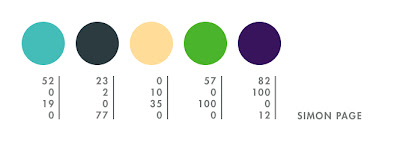
simon page is a designer and self-proclaimed technophile from the uk. his use of pattern, shape, and repetition is stunning. my favorite series is colourful universe, which combines all of the above mentioned elements with color! simon has also designed numerous logos and other wonderful bits of typography, such as this hard to read series—i do love a challenge. go see how many you can decipher.
the first colour is a colour i have been using for my latest tron poster and have come fond of. the rest are just my favourite colours overall.
Thursday, July 30
mikey burton
mikey burton is a talented designer located in philadelphia. his super fabulous letterpress coasters first caught my eye and the fun continued with his logos—my favorite being the death + taxes masthead. i’m also a fan of his comic book shop project and these three posters—wilco, joanna newsom, and ohio citizen action. some of mikey’s posters are available for purchase here…yay!
this is the color palette i developed for 20x200.com, but i find these colors keep appearing in all of my work. i can’t tell you how many times i’ve used a light blue and orange-red together. i’m not quite sure why this is. i find the majority of work i’ve done so far in my career is for clients on a very tight budget where i’m constrained to using 1 or 2 colors. a lot of times, i find myself pairing a pop color against black. high impact color for the least amount of money. i’m also quite partial to metallic silver.
Monday, July 20
trapped in suburbia
karin langeveld and cuby gerards are the fabulous designers behind trapped in suburbia, a multi-disciplinary design studio located in the netherlands. they caught my eye with their amazing interactive publications, including creative city the hague, sound & vision, and where there is smoke, there is fire. i am also loving these exciting light festival posters. check out their workspace / gallery—what a wonderful place!
at the moment we are kinda in a neon phase—particularly neon salmon. but unfortunately, you can’t get this in cmyk, so the next best thing is the pinkish red. then green is always good. aqua just reminds us of lovely italian sea (yep, just back from a holiday ; ). grey is needed to control all the cheerful colors and to get your feet back on the ground, and yellow is to lift up your spirit again!
Saturday, July 11
giulia santopadre
designer, giulia santopadre, gave me some much-needed typographic resuscitation. i am in love with her fresh take on all things type, especially her nerd glasses packaging, grow your own designer lettering, and finally this hot vice ambigram.
they just came to me.
Monday, June 29
elisa sassi
elisa sassi just moved from london to san francisco—welcome elisa! i especially love the way she pairs her whimsical illustrations with white backgrounds and unpredictable color combinations. elisa has created everything from ads and posters to exciting wall adventures. some of my favorite pieces include this amazing baby room, inspiring rainforest ad, and supercute san francisco print. i hope to see elisa’s original artwork in one of my favorite sf galleries very soon.
it’s one of my favorites palettes, maybe ’cause with it i can paint myself under a tree in a field of orange tulips under a blue sky wearing a white dress. =D
Friday, June 26
andrew bell
the head of andrew bell is filled with all kinds of things that may shock, scare, disturb, or just make you giggle. on occasion, i experience all
those feelings at once and i love it! my favorite creatures include for the dog, comb over, imaeachoo, picker, metitis, and tony danza…hee hee. you can also find all kinds of fun things, including toys and books, in andrew’s shop.
while i have recently been experimenting with bright colors, muted colors and everything in between, these few shades of grey, black and red will always be the bare minimum that i require to express myself. they may seem boring, but to me they are colors of infinite possibility. you’ll see them represented in thousands of creature drawings from the last 7 years, as well as in my own company branding and name. what is black, white and red all over?…a dead zebra.
Thursday, June 25
mayuko fujino
mayuko fujino creates some of the most gorgeous paper collages i’ve ever seen. i love the composition, shapes, color, subject—everything. my favorite piece is heavenly bodies #17, but other notables include heavenly bodies #5, black hummingbird, red wave, and this recent piece from mayuko’s upcoming solo show—the day of the sea (海の日 / umi no hi). the show opens in tokyo on july 20th. i hope to see some of mayuko’s work when i visit japan this september!
currently i’ve been working on new pieces for my solo show in july, and i use colors like these very often lately. i’m in the mood for these.
Tuesday, June 23
linda olafsdottir
linda olafsdottir is a fellow academy alumna, originally from reykjavík, iceland. she recently finished her mfa thesis, which includes several spectacular children’s book illustrations. my favorite is airplane, where the little girl in her story flies for the first time. i also love the mood and color palette of homesick and the stunning perspective of big city. you can stay posted on linda’s stories and illustrations on her blog.
p.s. good luck with your book linda…let me know when it’s published!
Labels:
blue,
green,
illustration,
orange,
yellow
Monday, June 22
june leeloo
flowers were the first love of artist, june leeloo. she dreamt of traveling the world as a botanist, yet happily ended up a painter. my absolute favorite leeloo piece is hatsuharu. i’m also fond of the peaceful sayoko, which you can see in person at the black maria gallery in los angeles through july 11th along with two other lovely leeloo pieces.
they are the colours i use the most, my very favourite ones.
Friday, June 19
áron jancsó
hungarian type-extraordinaire, áron jancsó loves to create type from scratch. he dreams it, draws it, measures it, painstakingly refines it and then presents it to the world. some of my favorite jancsó pieces include a type portrait, his experimental name piece, the wonderful opportunity poster, and a french film festival poster. i’m hoping his type will be available for purchase soon!
Sunday, June 14
7th wedding anniversary
my husband, izaak, and i spent our 7th anniversary in japantown this year. we aren’t really romantic in the traditional sense of the word, but there is never a dull moment with izaak. in september we are taking our first international trip to japan so this was a fun preview.
these colors were inspired by our day of japanese pop culture and sake, courtesy of hotel tomo.
Saturday, June 13
chris anthony
i am a big fan of photography, but rarely does it make me gasp the way a painting does. i had one of those moments when i saw chris anthony’s victims & avengers series. the concept, composition, light, and color—all stunning! specific favorites include emily #3, zooey #2, and max. be sure to check out the rest of his work if you aren’t familiar with it—the new venice* series, which opened at the corey helford gallery last march, is both shocking and serene.
*venice is a metaphor for a sinking city, deserving of nature’s wrath, leaving its citizens to tread water and explore new ways to sustain life
on aquatic earth.
*venice is a metaphor for a sinking city, deserving of nature’s wrath, leaving its citizens to tread water and explore new ways to sustain life
on aquatic earth.
Wednesday, June 10
igor dukic
igor dukic creates vector illustrations that feel original and impulsive. i am especially fond of these flowers, bleeding for help, and this silly holiday monkey. dukic also has an extensive icons portfolio—favs include bgreen, mosaic, and these loving pets.
dukic’s color palette was inspired by this recent illustration.
igor, better know as pez because of his long neck and large adams apple, comes from hills of central bosnia. let me lift my head and offer you a candy. i found myself through my art, i hope i can help you find you!
dukic’s color palette was inspired by this recent illustration.
igor, better know as pez because of his long neck and large adams apple, comes from hills of central bosnia. let me lift my head and offer you a candy. i found myself through my art, i hope i can help you find you!
Labels:
blue,
illustration,
orange,
purple,
red
Tuesday, June 9
josh kenyon
josh kenyon has found the perfect balance of design and illustration.
i absolutely love this wedding invitation…this one too! his diverse
portfolio is filled with all kinds of fun, including guitars and this
coveted bathroom.
i have pretty much only been designing in these colors for the past couple months. i am currently working on a zine/show with colby nichols under our collaboration name JOLBY. i know its a wacky palette but it was something that made me smile. i think that’s how i always pick colors.
Monday, June 8
bogdan chesaru
romanian photographer, bogdan chesaru captures images that are both exhilarating and serene. they transfix me for hours while i make up stories about them, but the most fascinating story is that of their creation. chesaru macro-photographs soap bubbles that have been captured in a wire frame, and he has titled this collection a kind of magic: the ephemeral universe of a soap bubble. two of my favorites are migration and substantia rubra—you can order your favorites here.
photographing light interference on soap bubbles is a very challenging process. my role as an artist is to isolate the most pleasant combination of colors from the vibrant chaos that form on the soap film. choosing just five solid colors from the rich gradients that i record in my images was quite a challenge. these were taken from awakening—one of my favorite soap bubble photographs.
Sunday, June 7
andy mangold
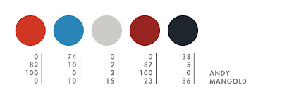
this bike-loving designer has a talent for making things fun—from his web language to his reinvented rubber band gun, the rubber bandit—andy mangold makes life more interesting. other favs by andy include this brain shopping poster, the hilarious otter pop tower, and his impressive book arts collection.
nothing is better than a nice, warm and toasty, burnt orange. i also enjoy ridiculously bright colors that hurt people’s brains and neutrals that are JUST A LITTLE BIT off of straight gray.
Subscribe to:
Posts (Atom)