Friday, July 31

simon page

simon page is a designer and self-proclaimed technophile from the uk. his use of pattern, shape, and repetition is stunning. my favorite series is colourful universe, which combines all of the above mentioned elements with color! simon has also designed numerous logos and other wonderful bits of typography, such as this hard to read series—i do love a challenge. go see how many you can decipher.
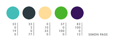


the first colour is a colour i have been using for my latest tron poster and have come fond of. the rest are just my favourite colours overall.

Thursday, July 30

mikey burton

mikey burton is a talented designer located in philadelphia. his super fabulous letterpress coasters first caught my eye and the fun continued with his logos—my favorite being the death + taxes masthead. im also a fan of his comic book shop project and these three posters—wilco, joanna newsom, and ohio citizen action. some of mikeys posters are available for purchase here…yay!


this is the color palette i developed for 20x200.com, but i find these colors keep appearing in all of my work. i cant tell you how many times ive used a light blue and orange-red together. im not quite sure why this is. i find the majority of work ive done so far in my career is for clients on a very tight budget where im constrained to using 1 or 2 colors. a lot of times, i find myself pairing a pop color against black. high impact color for the least amount of money. im also quite partial to metallic silver.

Monday, July 20

trapped in suburbia

karin langeveld and cuby gerards are the fabulous designers behind trapped in suburbia, a multi-disciplinary design studio located in the netherlands. they caught my eye with their amazing interactive publications, including creative city the hague, sound & vision, and where there is smoke, there is fire. i am also loving these exciting light festival posters. check out their workspace / gallery—what a wonderful place!


at the moment we are kinda in a neon phase—particularly neon salmon. but unfortunately, you cant get this in cmyk, so the next best thing is the pinkish red. then green is always good. aqua just reminds us of lovely italian sea (yep, just back from a holiday ; ). grey is needed to control all the cheerful colors and to get your feet back on the ground, and yellow is to lift up your spirit again!

Saturday, July 11

giulia santopadre

designer, giulia santopadre, gave me some much-needed typographic resuscitation. i am in love with her fresh take on all things type, especially her nerd glasses packaging, grow your own designer lettering, and finally this hot vice ambigram.


they just came to me.