Sunday, January 31

luke haynes

my grandmother owned a small quilt shop in rural kansas, but the quilts i grew up with are quite different from those sewn by artist, luke haynes. luke’s modern interpretation of the quilting process is refreshingly unique, and i am excited to see how his work evolves. favorite pieces include abraham lincoln, woods, and red leaf (back). for show inquiries, commissions, or to purchase quilts, contact him here!


i chose these colors, because they are the colors that i see. the colors i pick out when i walk into a fabric store and am barraged by the entire palette of color on the walls knocking me over the head.

Monday, January 25

elsa mora

wow, where do i begin? elsa mora, aka elsita, is a cuban-born artist whose talent exceeds classification. i knew of her first as a paper artist, responsible for perfectly-curved edges and the conceptually-brilliant paper sculpture, fears, and el corazon. more recently, i’ve been following her—GASP personal style, which has left me equally enchanted and a tad underdressed. her creations span all media—here, a few of my favorite gems: el jardin de maria julia, missing garden, mimi, unlimited flower protection, felted necklace, emanuel, her way, uchi…i really could go on forever. OH, and did i mention her new book?! for updates on all things elsita or to purchase her lovely creations, stop by her main blog.


here i did a selection of colors that i love. but the truth is that i love all the colors in the rainbow. to me each color is a door to a new world, each one of them has a personality, a language and i’m always curious to see what they “have to say”.

Wednesday, January 13

lindsey manwell

lindsey manwell is a san francisco children’s book illustrator who creates some of the most enchanting scenes. her soft little characters appear to lead such charmed lives. my favorite illustrations include windup, tort, shelf, and one of her new characters, wart. you can follow her blog for recent work and activities.


i don’t really know why anyone is drawn to the colors that they are drawn to, but i do know that the most emotion for me, from any picture, comes from the color compilation. i’ll never forget seeing sargent’s fumée d’ambre gris—it was perhaps this image that made me become an artist all together, it was that powerful. i tend towards lighter, muted colors all over with highlights of deep, rich color.

Tuesday, January 12

christine berrie

i am thrilled to bring you glasgow-based illustrator, christine berrie. i am fascinated by her drawing collections. hooray for microcars, alarms, and my absolute favorite—cameras! if cameras aren’t your thing, check out her etsy shop, which is filled with all sorts of carefully-rendered treasures.


christine’s influences* london markets, bric-a-brac, flickr, vintage picture books, old buildings, glasgow city centre, antique shops, vintage posters, printed ephemera and found scraps, tickets, retro film posters, london underground and the tate modern.

*via comarts.

Tuesday, January 5

romain philippon

i find romain philippon’s inconscience incredibly captivating. i love examining the photos for trinkets and other clues to personality and profession, while the owners lie sleeping. i enjoy seeing people through romain’s eyes—everyone is so real, yet hopeful. other favorites include a0003b, a0018, and a0007. romain lives in réunion, an island amidst the indian ocean. for inspiration, check out his blog.


to me these colors mean asia, africa, europe, south america, and reunion island (where i live).

Monday, January 4

monina velarde

monina velarde is a chicago-based graphic designer who recently won
the aiga command x competition—congratulations! i am a fan of her lift airlines identity, this superfun new year’s resolution generator, and cleanse packaging, which you can view on her site. you can follow monina’s work…and possibly score some tasty-looking baked goods
on her blog!


one of my favorite projects that i’ve gotten to work on was designing the identity for the kansas city art institute school of design. i worked on it
with my good friend, jessica bayer. we took the basic elements of swiss design, the fundamentals of what the kcai design program was founded on, and reinterpreted them to fit within today
’s design culture. we derived our color palette from swiss poster design. the colors used were primary green, yellow, red, blue and black. these colors were then updated by us to fit contemporary design.

Sunday, January 3

tiffany shih

tiffany shih designed the most fantastic bra packaging i've ever seen. what i wouldn’t give to be an apple. i am also fond of her how to be a texan poster, which you can use to make your own hat—yeehaw! i can’t wait to see what this girl comes up with post-graduation.


my work tends to be obnoxiously bright, bold and loud. i think it’s very reflective of my personality—not to say that i annoy everyone that i come across (although friends and family might say otherwise), but i’m not afraid to be goofy and sing loudly on the streets if i feel the sudden urge to. i’ve also been told by the roommates that they can hear me laughing in my room through the window from a couple of streets away.

…yeah…i’m one of those people.

Friday, January 1

happy new year!

thank you to all of the wonderful creative people who sent me colors in 2009…there were over 100 palettes! it looks like blue is still the favorite. here’s to 2010!

Monday, December 14

mike rivamonte

i am very excited to bring you robot sculptor, mike rivamonte. he is an avid science fan who grew up making anything he could get his hands on. his curious mind comes up with some of the most endearing robots i’ve seen. i want to be friends with edison, walt, and ace—complete with led jet pack! be sure to check out mike’s prints too.


my work is greatly influenced by my family. as kids my mom would take us to countless antique stores, curio shops and flea markets. during these ‘field trips’ i marveled over dusty scientific instruments, phonographs and other obscure mechanical devices. i developed a deep appreciation and interest of inventions and history. i picked up the love of making things from my father and uncles. my dad built our first color television set, all kinds of radios and our first computer. he could and would build anything. we constructed many things together. my uncles, one a science teacher the other a carpenter, fueled my inquisitive, experimental nature and appreciation for the finer points of craftsmanship.

Sunday, December 6

cate anevski

cate anevski is a creative extraordinaire that i found on flickr…back in march! for some reason we keep losing each other in the interwebs. i email her, she emails me, i never get it, i email again, she emails me, i bury the email in my box—no more of this—it is time! what i love most about cate’s work is her charming outlook on the world. her unique style is present in every medium she uses. my favorite illustration work includes celtic knot, marie antoinette, and elemental nymphs, which are now available in cate’s etsy shop! i’m also a fan of her eleven-eyed monster and leet embroidery skills. for recent work, updates, and all things worth doing in portland, stop by her blog.


i have recently undergone my first portland, oregon, winter, and the gray weather left me a bit starved for the warm colors of the sun. my latest illustrations reflect this with a bright pink and orange palette.

Friday, November 27

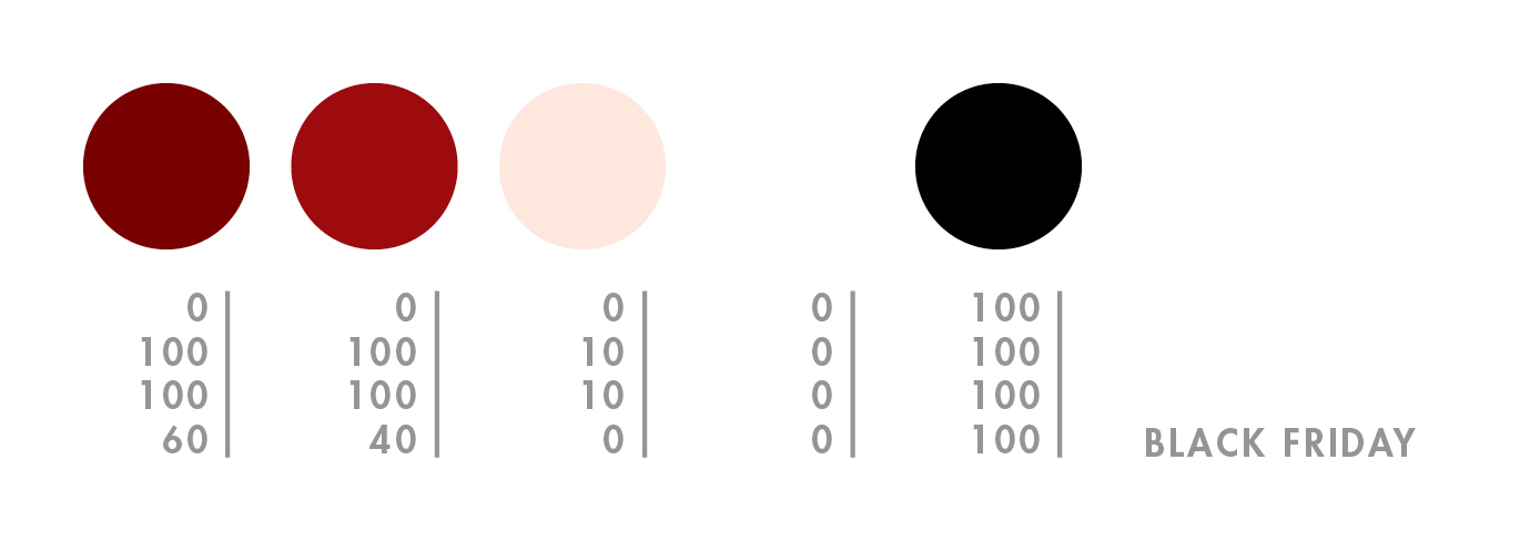
black friday

oh black friday, i’ve easily ignored you in the past, but this year i made an exception…for bras. shopping is one of my least favorite activities, especially if it’s for something i have to wear because i’m incredibly picky with a side of freakish proportions. however, this year i just happen to live within two blocks of macy’s, so i got dressed and left the house around 4:30am. i had some coffee, compliments of macy’s, watched all the cute girls coo in front of the window, and mentally prepared myself for what was to come. finally, they plugged in the last bit of neon and opened the doors. we were greeted by a very authentic rosy-cheeked mr. and mrs. claus as everyone flocked downstairs to make-up and housewares. i escalated to the 5th floor, grabbed a handful of bras that were close to my size, and entered the fitting room. a very small woman yelled at me from outside—YOU LIKE? well…not really. GIVE ME SIZE, I FIND YOU GOOD ONES. she passed a handful back to me…UGLY, BUT COMFORTABLE…YOU TRY! ok, ok. they were very lacy, and quite the opposite of my tastes, but they felt like silky magic on. so i bought three for $50. the end.


macy’s windows | mr. & mrs. claus | bra | bra | bra

Thursday, November 26

happy t-day

this is our 5th thanksgiving alone since we moved to san francisco, and we’ve turned it into our very own yellow day of joy. we spend wednesday evening and thursday morning baking (in our underwear) the tastiest, most midwestern plate of carbs you’ll ever see.* for a laugh, check out my husband’s thanksgiving shopping list.


my plate: homemade noodles | stuffing | mac + cheese | corn | potatoes
*no, that roll isn’t giant…the plate is tiny.

Sunday, November 22

alvin diec

i stumbled upon the work of alvin diec way back in august, but i was too busy preparing for my first international trip to write him a proper post. diec is an atlanta-based designer who does what i can only think to describe as beautifully-clean work. his love of food has inspired some wonderful projects, including one flew south and the buccaneer, two of my favorite stationery sets. other notables include his fleet foxes poster and pygmalion theatre promotion, which i yearn to see in detail. finally, if you are in need of design clarity or just want to see what diec is thinking, check out his blog!


the idea is pretty simple. food and drink are probably two of my favorite things. ever. so it happens, i spent a few years doing design primarily for the restaurant industry. it comprises a large part of my portfolio and still represents much of the work i’m most proud of. we’ll just go through a small meal of things i really enjoy, in no particular order: crispy bacon, cloudy wheat beer, plain ol’ white rice, fresh greens, and hot coffee. cheers.

Monday, October 19

michelle ‘milo’ white

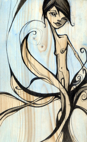
michelle ‘milo’ white is a line-lovin’ lady who uses graphite and acrylics to create unique, angular characters. my favorite part about her work is the way she renders faces, carving them out piece by piece like a wooden sculpture. i am fond of tree, nymph, memories, shin bone, and twin. be sure to check milo’s blog for new work.


i’m a san francisco illustrator who’s crazy about line work. i use color in a supporting role…very little…just a pop of pink to breathe some life into a piece. i love architect’s handwriting, blueprints and wood grain. my colors may appear subtle but they are accompanied by a heavy hand of black ink. the juxtaposition of the two brings me balance.

Sunday, October 18

jennifer davis

i was ecstatic when i stumbled upon the work of artist, jennifer davis. her colors are so unique. she uses soft linework and surrounds her charming cast of characters with magical environments filled with balloons and bits of nature. because she works with such a serene palette, her paintings feel even more special when she adds a bright color. the paintings i enjoy most are sea lions, sent, refrain, remember, catharsis and listen. visit her blog for new paintings and show info.

Saturday, October 17

emil kozak

emil kozak is a versatile designer with an an eye for beautiful repetition. kozak’s soaring vectors and clean, yet complex shapes are just the right amount of detail to complement his delightfully unexpected compositions. favorites include elements spring 09, exhibition gallery, and manual. be sure to check out his shop!


obsessed with water…

Friday, October 16

frank chimero

today i bring you frank chimero, a super-talented illustrator, designer, and writer. frank is full of ideas, and he is pro at concise communication. i love his life and design poster, state illustrations, and monster tee most of all. AND in addition to his extremely entertaining blog, he also co-writes questionable characters with ben barry. go get some answers!


so i’m sitting at a table with a full setting for myself and a few good friends. i’m on a trip in the san juan islands, a couple of small blobs of land poking out of the puget sound thanks to some geographic anomaly. there’s a huge set of windows to my right. if i look out, i have a view of all the other tree-speckled islands, which fade off in a blue atmospheric haze. it’s clear today, and it feels like i can stare out forever. also, this napkin is yellow and orange and purple.

Thursday, October 1

nara

we contemplated skipping the day trip to nara all together. we grew up around deer so it didn’t seem worth the bumpy train ride through the mountains—my husband gets pretty severe kinetosis. we were thrilled to be wrong. it may have been the most enjoyable thing we did together. in retrospect it makes sense, we both get more excited about animals than people. and when they look like this, how could you not love them? the secret to enjoying the deer in nara is this—either buy shika sembei (deer biscuits) and quickly feed the deer or do not purchase biscuits at all. running around trying to photograph the deer while taunting them with biscuits proved traumatic for many visitors that day. the deer have learned that head-butting the men in the groin make the biscuits magically fall from the sky. since women often squeal and run, the deer chase them in a herd until the biscuits are surrendered. they do seem to leave the children alone for the most part, only reaching high into the air to snatch the biscuits from the smallest ones. and the cutest thing happens while they await their treat—they bow! some say they have learned to imitate the japanese, others (my husband) says they are simply preparing to buck you in the crotch. either way, it is done with the tongue slightly out and is the cutest thing i’ve ever seen.


bambi bow.

Tuesday, September 29

gion

exploring gion’s rain-soaked alleys was a magical experience. the machiya architecture with its lovely lanterns, bamboo inu yarai, and ceramic roof tiles all add to to the mysterious beauty of this well-known geisha district. i was lucky enough to catch a glimpse of both geiko and meiko—two in the back of a black car, and i passed another in a narrow alley. i do not have photos of these encounters as i decided to constrain my gaijin instincts and respect their privacy, but i was excited to find that they are even more stunning and graceful in person. hopefully these traditional artists continue to perform in the future. i have a lot of respect for women who brave the rain in a kimono.


mysterious geiko.

Saturday, September 26

himeji castle

we took a day trip to himeji to see himeji castle, also known as the white heron. it’s the most impressive castle i’ve seen, complete with moat, stoney fortress, super steep stairs, and secret doors. and if that weren’t enough to remember, my first cup of matcha was served at the koko-en garden tea house. it was hot, frothy, and my favorite hue of green. i even learned how to make it using a bamboo chasen! and although my sugar handicap prevented me from sampling the wagashi, i was able to capture the handmade confection forever. banzai!


matcha castle.